
If you don’t know who the gentleman playing Repton: The Lost Realms is, then it’ll probably be impossible for me to explain how happy discovering this picture earlier this week made me feel.

Does a bit of everything, badly
If you don’t know who the gentleman playing Repton: The Lost Realms is, then it’ll probably be impossible for me to explain how happy discovering this picture earlier this week made me feel.
Thanks to Dave Moore at Retro Software, I received a very exciting package in the post last week:

It seems so strange to go from a sketch on an envelope, to producing artwork in Inkscape to a finished product on my shelf with a 5.25″ floppy inside.
If you want to get hold of your own copy of Repton: The Lost Realms, it is available here.
The R3PLAY Arcade, Retro and Video Gaming Expo was held on the 6-7 November in Blackpool and, as I said a few days ago, it saw the official launch of Repton: The Lost Realms.
The visitors to the show had the poster I designed inflicted on them as they were queuing to get in:

The Retro Software team were ready and waiting to sell millions of copies:

Needless to say, the game completely sold out. And no wonder, the finished article looked gorgeous – in spite of the fact that I did all the artwork:

We were honoured that Repton took time out from running his HSE-free diamond mining conglomerate to attend in person:

The Beeb performed masterfully:

And so did its half brother by the milkman, the Acorn Electron:

Contributing to a real Repton release was a childhood ambition of mine – and one that, somehow, I’ve now managed to fulfil.
Paras Sidapara, Tom Walker, Michael S. Repton, Jonathan Parkin, Richard Barnard, Dave Moore, Peter Edwards, Andrew Weston, Richard Hanson, Matthew Atkinson, John Chesney and of course the durian munching genius polymath that is Tim Tyler all put a huge amount of work but most of all love into Repton: The Lost Realms and I think that really shows.
I’m really honoured I got to be a part of the team.
If you’ve been here before, you’ll probably already know that this year is Repton‘s 25th anniversary. And, as part of the celebrations, Retro Software is releasing Repton: The Lost Realms for the BBC Micro and Acorn Electron.
I’ve already blogged about creating the cover artwork and the loading screen for the game. However today is the 6th November and Repton: The Lost Realms is being officially launched at R3PLAY in Blackpool. That means I can at last talk about creating the graphics for the game itself.

I was first approached by Dave Moore about contributing to Repton: The Lost Realms in mid 2008. Peter Edwards had just recovered a load of my old Repton 3 and Repton Infinity screens from some of my 5.25″ floppies and the graphics in them had impressed Peter and Dave enough for them to ask if I would be interested in creating some screens and graphics for Repton: The Lost Realms.
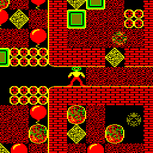
Like Repton 3 before it, Repton: The Lost Realms is a game that allows you to not only edit its levels, but also redefine its graphics. That means that it’s possible to provide a selection of different screens and graphics for players to load into the game.

At this stage, the Repton: The Lost Realms came with only one set of screens. As you can see above, it used the Repton 3 graphics with a few additional graphics for the game’s new elements designed by the game’s original programmer Paras Sidapara.
As there were to be four sets of six screens included in the game, my first idea was to theme each set of graphics around the existing Repton releases. In other words, have a Repton 1 set…
…a Repton 2 set…

…a Repton 3 set…

…and a new set for the final set of screens.
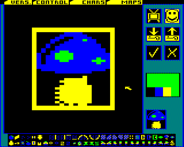
I quickly hacked about and transferred the graphics from these games into Repton: The Lost Realms. At this stage I was designing new characters in the Repton Infinity graphics editor (Film Strip) and then transferring them over to Repton: The Lost Realms by transferring blocks of data between files using the BBC BASIC command line.
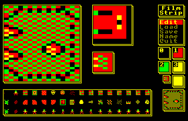
The reason why I preferred Film Strip was that it was designed for use with a keyboard. I didn’t have a real BBC Micro to use so I was using these programs via the excellent emulator BeebEm. In fact, as at that stage there wasn’t a native GNU/Linux emulator for the BBC Micro at the time, I was using BeebEm via WINE.
The Repton 3 and Repton: The Lost Realms editors had adopted the then very fashionable WIMP paradigm. However, using a WIMP interface with a keyboard is very hard going and I found the AMX Mouse option tricky to get working in BeebEm. That meant I couldn’t use these editors with my mouse.
Another problem I had with Repton: The Lost Realms’ editor was the awful yellow and black colour scheme used for the editor’s pointer. It was probably the worst colour scheme you could have picked if you want to design graphics precisely – the outline of the pointer gets lost against black, but most of the graphics have black backgrounds or outlines!
After I had designed Repton 1 and Repton 2 themed graphics it soon became obvious that this approach would not work. There were various new elements in Repton: The Lost Realms that were not present in previous Repton games. I wanted to redesign these in each set to match the style of previous Repton releases. However Dave wanted to keep the new game elements that Paras had designed looking the way Paras had designed them. However this would have looked out of place, particularly in Repton 1 which is quite abstract and geometrical in design.
Therefore, after talking it over with Dave and Paras we decided it would be best if I design four completely new sets of graphics for the game, bearing in mind the need to keep the original design of Paras’ new game elements in each set. We would also only vary the game characters that varied in the sets of screens supplied with Repton 3: namely the walls, eggs, monsters and crowns.
I had a few ideas for the graphics having got used to playing the game. I didn’t think that the inverted cage colour scheme for the anti-clockwise spirits worked at all. I needed to find a way to make these cages look a little less incongruous. I wanted to make the graphics look 1988-ish – so I used the style of later BBC games like Richochet and Star Port as inspiration. And I wanted to use stippled colours as much as possible to make the apparent colour palette seem more than the four colours that the game was limited to.
I designed the set of graphics for the final set of levels (PRESTO) first. My inspiration for these were the full-page adverts for Repton 2 and Repton 3 that Superior Software used to run in Acorn magazines at the time. In particular, I wanted to design a set with light mortar between distressed bricks. I’m very proud of this set and I think it’s actually my favourite.

I got a bit carried away, and I also redesigned Repton to look like he did in Superior’s adverts – this was very quickly and firmly rejected, and rightly so!
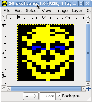
I had one set down, three more in front of me and even using FilmStrip on a BBC Micro emulator seemed like very hard going. I really wanted to use The GIMP to design the graphics and suddenly it dawned on me that I could.
I could design the graphics in The GIMP and then transfer them to the BBC Micro emulator using the BBC Micro Image Convertor by Francis G Loch. This is an application written in PureBasic that takes image files (bmp, jpg, etc.) and downconverts them into the native screen display formats of the BBC Micro.
The process has a few stages. First I design all the graphics as separate files in The GIMP:
Then I use the GIMP to slice them up and put them in rows:

And finally I convert the graphic into BBC Micro format using the BBC Micro Image Convertor:

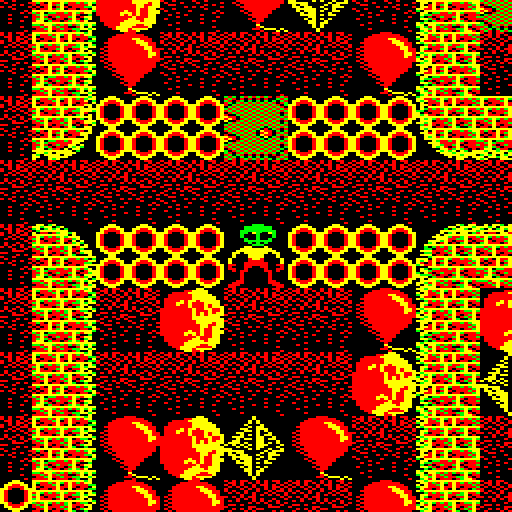
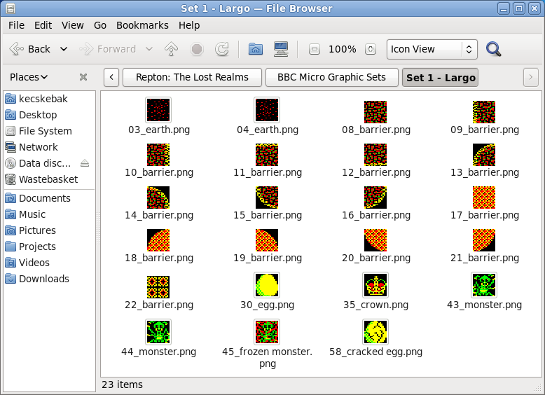
So, I fired up The GIMP and the next set I designed was for the LARGO set. This is the default set that loads when the game or editor loads, and the levels in this set were the original six levels designed by Paras Sidapara back in 1988.

Because I knew Paras was a huge fan of the game Exile, I decided to base the design of the walls on the walls found in Exile. This set looked very nice and thanks to The GIMP I was able to design them very quickly.

The third set I designed was a set for the ADAGIO screens. This set was a kind of cross between the walls found in Exile and the walls found in Repton 2 (my favourite Repton release). It didn’t work as well as I would have liked and I wish I’d done something a bit different.

The final set I designed was the ALLEGRO set. It was loosely based on the graphics for the game XOR, which my children were madly into playing at the time. This set has been described as looking “juicy”, whatever that means! Dave Moore accused me of taking a little more care over these graphics than some of the others because I knew I was designing all six levels to go with them. How very dare he!
The work on the graphics Repton: The Lost Realms was very straightforward. I did very little rework once we decided on what we were doing and there were only two real debates about the game characters. The first concerned earth, the second concerned fungus.
As far as the earth is concerned, I wanted to experiment with some dense Ravenskull style earth, whereas Dave Moore preferred the very sparse earth used in the Toccata level set of Repton 3. Dave got his way on that one!
The fungus debate concerned my preference for fungus that looked like a toadstool rather than the amorphous mould that was presented in Repton 3. In the end, I redesigned the fungus to look slimy rather than mouldy but it’s probably the graphic I am least happy with.

We also had a discussion about the “freeze pill”. This was a green pill that froze monsters temporarily. What with absorbalene pills and time pills I thought Repton’s drug habit had gone far enough.

I wanted to replace it with a Citadel style snowflake. Everyone agreed, and that also involved making changes to the editor and game map graphics which I did by hacking the code about. But, although my snowflake was a good idea, I think the graphic I designed was horrible.

Once I’d designed all four sets, I thought that that was that – only it wasn’t. By this stage Tom Walker (someone for whom the word genius seems utterly inadequate) had joined the project, and had started work coding an Acorn Electron version.
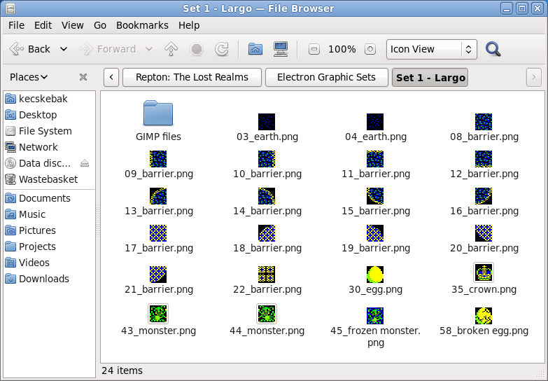
The Acorn Electron is cruelly afflicted in many ways, but one of the worst is that it has no hardware scrolling. That is terrible news for a game like Repton which relies on scrolling. Acorn Electron scrolling has to be done in software, which eats up the memory available for the game – and its graphics. The graphics in Acorn Electron Repton: The Lost Realms are 12 x 24 instead of 16 x 32 for the BBC Micro version.
This meant I had to create cut down versions of all of the games’ graphics for the Acorn Electron version, and doing this took as long as it took to create the original graphics. In fact, I put in so much effort I actually prefer some of the Acorn Electron graphics.
Probably the most interesting thing about doing this was the lack of an Acorn Electron editor – or indeed an Acorn Electron version of the game itself! I had actually finished the graphics and put them in game files before Tom had finished coding the Acorn Electron version of the game.
It was quite some time after I had finished the graphics that I was actually able to play with the graphics in the game itself via Tom’s excellent Acorn Electron emulator Elkulator.

Keen eyed Repton fans will notice that Acorn Electron Repton: The Lost Realms reintroduces Tim Tyler‘s Repton sprite from Repton 2. I think this has much more personality than the one used in Repton 3.
I knew that there was a keen interest in the Repton: The Lost Realms from Acorn Electron enthusiasts so I put an enormous amount of effort in the graphics for the Electron version – I just hope they like them!
And finally – a word about the design of the crowns. I spent many years living in my wife’s home-town of Mélykút, the birthplace and home of the legendary restorer Szvetnik Joachim. He was famous for supervising the return of the Holy Crown of Hungary from the USA in 1977. I went to his workshop in Mélykút to translate for some tourists from New York State, and enjoyed my visit so much I decided to make the crown in ALLEGRO look like the Holy Crown.

The other crowns in Repton: The Lost Realms are also based upon real crowns – I wonder if you can work out which ones?
I’ve just turned 38, which means I’ve been a keen Repton fan for 24 years. It seems incredible, but next year is Repton’s Silver Jubilee.
If you don’t know what I’m talking about, if you look through the Blog Archive you’ll see I’ve talked about the computer game Repton several times: both the cover art and graphics I’ve done recently for Retro Software and also some of the screens and graphics I designed on my BBC Micro back in the 80s.
This time of year – Christmas and my birthday – always makes me think of Repton. Waiting for Christmas 1986 was almost unbearable as it was then I was going to get a copy of the latest Repton release, Repton 3. I didn’t have a disc drive at the time, so my copy of Repton 3 would be on cassette tape for the BBC Micro.
The excitement was because, for the first time ever, I was going to be able to design my own levels and graphics for the game and I couldn’t wait. I only had a couple of C15 cassette tapes to store my levels at first, and I as I designed levels and graphics I’d save over my previous work again and again. And sometimes a quirk of the cassette recorder volume or tone control meant that the file wouldn’t save properly. I dread to think of the number of levels and character designs I lost.
However, one of the very first levels I designed that Christmas I was so pleased with it just seemed to hang around and hang around and I still have it to this day. The password for the level is “TIMOTHY” – named after my pet goat at the time and it was always screen G (for Goat).

I actually could only complete this level with great difficulty for many years – I used to be happy if only I died twice when completing it.
Eventually, using information I’d gleaned in a Hac-Man article in The Micro User I culled all the easy levels I’d created on various tapes and 5.25″ floppies into one set – Set1.
Set1 also featured a customised set of graphics. I was very disappointed with the graphics in Repton 3. This was because they didn’t look like the abandoned diamond mine on the cover art. They were all clean and clinical and didn’t have much character. So I sat in front of Repton 2 with coloured pencils and recorded every sprite faithfully on graph paper.

Then I entered all the character designs into the Repton 3 editor – a process that took a very long time and was rather difficult on a fuzzy Microvitec CUB CRT monitor.

Recently I’ve been thoroughly enjoying the Repton level play throughs posted onto YouTube by SentinelProxima, ReptonGeek and TestPilotMonkey. SentinelProxima is the YouTube channel name of Michael S. Repton, undoubtedly the world’s best Repton player.
I was curious to see how Michael would tackle Screen G, as I take an age to complete the level even now. Michael very kindly produced a long playthrough of all the screens.
The first four levels are completed here:
And the second four levels are completed here:
It was incredible to watch Michael complete my levels – all far more elegantly and with greater efficiency than I could ever manage. As I’ve said before, the effect of watching someone so good play Repton is as compulsive as watching a 147 break in snooker. It really was a pleasure to watch, and it was a truly fantastic birthday present.
Lovingly prepared new versions of Repton 1, Repton 2, Repton 3 and Repton Spectacular are available to buy for the Microsoft Windows operating system from Superior Interactive. And, for those lucky enough to use the GNU/Linux operating system, you’ll be pleased to hear all three games work reasonably well with WINE.
You can download my levels for Repton 3 for the PC version of Repton 3 from here.
You may remember I blogged about bits and bobs I did for the Acorn World Show, which was held on the 13th September 2009 in Huddersfield. You also probably know I’ve also done a lot of work this year for one of the main exhibitors, Retro Software.
The Centre For Computing History, the museum that’s preserving some of my work for posterity, made video recordings of some of the speakers at the Acorn World show and one of the speakers happened to be one of the geniuses behind the BBC Microcomputer and the Acorn Risc Machine or ARM chip, Professor Steve Furber CBE.

They’ve posted Professor Furber’s talk online, and I’m delighted to say that you can see him wandering about in front of my posters for pretty much the whole video. I’m sure he was only standing in front of them so they wouldn’t make the audience vomit, but it still made me incredibly happy.
The Retro Software stand at the event was so successful that Dave Moore of Retro Software was asked by the organisers of the RISC OS London show if he would exhibit it there too. Dave sent me a picture of the Retro Software stand at the show, complete with three posters two adverts and a banner I’d designed for him. It looks incredible and, again, it made me feel very happy.

Before the RISC OS London show, Dave was offered a free advert in the new .pdf format RISC OS magazine “Drag And Drop“. Dave asked me to modify one of the adverts I’d designed for him.
One of the modifications he asked me to make was to replace the “See us at the Acorn World” flash with a “See us at the RISC OS London Show” flash. To do this, I needed to make a vector copy of the small bitmap RISC OS London Show logo Dave supplied me in Inkscape. I copied the logo quite faithfully, but I couldn’t resist changing the Gill Sans for the rather more fitting Johnston’s Underground.

You can see the advert in the sample copy of “Drag And Drop” that’s available here.
After I created the artwork for “Repton: The Lost Realms“, Dave Moore of Retro Software asked me if I would create a loading screen for the BBC Micro and Acorn Electron versions of the game. Initially the brief was quite loose – he thought we needed a Mode 5 screen for the cassette versions and a Mode 1 screen for the disc versions.

On a BBC Micro or Electron, Mode 1 and Mode 5 are both four colour screen modes. The difference is that in Mode 1 the resolution is 320 x 256, whereas in Mode 5 the resolution is 160 x 256. However, both images are the same size because in Mode 5 the pixels are twice as wide as they are high. Due to its lower resolution, Mode 5 uses half the memory of Mode 1 so will load far more quickly for those using cassette recorders.
My first thought was to create the Mode 1 screen, and to use the excellent BBC Micro Image Converter software by Francis G Loch. This is an application written in PureBasic that takes image files (bmp, jpg, etc.) and downconverts them into the native screen display formats of the BBC Micro. To aid you in doing this it offers an almost bewildering array of image processing options specifically tailored for getting modern images into BBC Micro format. It can also takes BBC Micro screen dumps and convert them to modern image formats.

I use Ubuntu Linux, which means I have to run the Windows binary of the BBC Image Converter under WINE. I’ve found the operation of the program under WINE to be problematic if you don’t export import and output images from and to the WINE “C:Program Files” folder. It also seems happier with being fed bmp files than pngs under WINE.
Inspired by Michael “Mic” Hutchinson’s excellent loading screen for the disc version of Repton Inifinity, I decided to use the same Red, Black, White Green palette. I was very pleased by my early results – particularly the way the brown came out on the safe. However I hadn’t left any room for branding and so on.

So I decided to create a version that had an area at the bottom that could be removed in the same way as the version on Repton Infinity disc for loading messages etc.

I showed Dave this version and he had a number of reservations – the main one being that the loading screen in Mode 1 didn’t really grab him at all. He wanted something more colourful for the disc version, and he suggested trying Mode 2. Mode 2 is identical to Mode 5, apart from the fact you can use eight colours.
The first thing I did was to create a screen in Inkscape that was 320 x 256 pixels that was set out exactly as I wanted to my loading screen to look. I would use this to feed into the BBC Micro Image Converter.

When I imported it, the results were excellent. In fact, the results were too good. Although obviously I needed to retouch here and there to tidy up the writing and the balloon strings I was overwhelmed by the feeling that really I should be producing something that was done by hand on a pixel editor – not put through some ingenious image processing we could only dream of in 1987.

Therefore I fired up “The GIMP” and tried to add a sort of “hand designed” feel a pixel at a time. I was quite aware that what I was doing wasn’t as good as what the BBC Image Converter could produce, but the idea was to get a “retro” feel.

I showed Dave Moore and he was happy with the Mode 2 screen, so the next job was to produce the cassette loading screen in Mode 5.
When it came to creating a Mode 5 screen, I decided to convert the eight colour Mode 2 screen to a four colour Mode 5 screen by hand, instead of running through the BBC Image Convertor again. This was because I wanted to keep the two loading screens as close as possible to each other in appearance.

Dave was happy, so that was my first two loading screens for Retro Software done and dusted.
Repton: The Lost Realms is under development by Retro Software. Repton name used by permission of Superior Interactive.
The BBC Image Converter is currently released under a non-free licence but it’s free as in beer to use for commercial or non commercial uses. You can look at a number of the PureBasic routines Francis wrote for it here.
The Acorn World show is still on today, and one of the things you’ll be able to see there are some rather retro looking adverts for games from Retro Software.
Dave Moore always liked the Superior Software adverts of 1984-1985 vintage. In particular there were two styles he liked. The full screen blue version that advertised one game:

And the “split” ad that advertised two games:

He wondered if I could do something similar in Inkscape for him to use as promotional materials at the show. The job turned out to be quite straight forward as I had all the things I needed. I had created the svg of the Retro Software logo as well as the original cover artwork for Zap! and The Krystal Connection.
Here’s my rendition of The Krystal Connection:

And here is my “split” ad:

The main thing I had to watch was keeping the colours muted, and again the Tango icon palette was my friend here. I used it to create the artwork for The Krystal Connection and I’ve become rather fond of it. The font was Bahaus – it was difficult to resist adding the Access credit card logo though!
Mountain Panic is a new arcade adventure for the BBC Micro based on At the Mountains of Madness, a novella by H.P. Lovecraft. It’s being programmed by Dave Footitt for Retro Software, and it’s shaping up to be really quite something.
And it’s not only the game that’s stunning. The cover artwork by Roger Coe and Chris Hogg is as well. So stunning in fact that Dave Moore of Retro Software naturally wanted to produce an A2 poster of it to use at the Byte Back retro gaming show that took place at Stoke-on-Trent in March.

However the artwork presented Dave with a number of difficulties. It was a 1053 x 744 png file, which was too low a resolution for an A2 poster. Although the painting actually scaled well, the lettering didn’t work at all scaled up to A2 – and it was burnt into the image. So he asked me if there was anything I could do.
After I had a look at the image, I decided the only thing to do would be to create the Mountain Panic lettering as an .svg, which would allow its use at any size, and paint out the lettering on the original artwork in The GIMP.
The Mountain Panic lettering was easy to produce in Inkscape; basically it was a simple hand tracing job.

Then I turned to the painting – it took me a couple of hours to paint out the Mountain Panic lettering in The GIMP. The hardest part was painting out the letter C that went over the mountain. Dave also asked me to extend the image downwards to the extent of the A2 page as well.

You can download a demo of Mountain Panic that will work on a BBC Micro emulator (or a real BBC Micro!) from the Retro Software website.

Back in the 1980s, when I had a BBC Model B running Acorn MOS instead of a PC running Ubuntu, I used to be a very keen Repton player.
If you haven’t heard of it, Repton is an engrossing puzzle game that also contains arcade elements and it seems to appeal equally to people of all ages. My youngest daughter Mary is 6 years old and a particularly keen player.
In 1986 the third Repton game was released and it was my Christmas present from my parents that year. Although Repton 3 wasn’t my favourite Repton game (that was always Repton 2) it did allow you to design your own screens and, even better, redesign the game characters.
I soon became a keen Repton character designer, and this obsession held when I received into Repton Infinity. But I never showed my screens to anyone else at the time. I didn’t even know another BBC user with Repton!

I used to particularly look forward to summer holidays and half terms when my Dad would bring home a BBC Master 128 which meant I could flip between the editor and game by pressing the break key. This small improvement speeded up designing Repton screen sets enormously.
In the middle of last year, on the Stairway To Hell forums, Acorn enthusiast Andrew Weston announced that he was putting together a website of all the non-official Repton levels that people had designed over the years. I mentioned that I had some but they were on 5.25″ floppy disc and I had no way of transferring them to a BBC Micro.
One of the forum administrators, “Samwise”, offered very kindly to transfer my discs to Emulator disc images that I could run on my PC. And, by return of post, I had my Repton 3 levels (and many other things beside) working on BeebEm on my PC.
Not all of my levels were on the discs I sent to Samwise, but the three sets with the best graphics were (some of my better level designs will have to wait for another time).
I sent the levels off to Andrew and he added them to his website and, after that, things seemed to take on a life of their own.
First came the offer from Dave Moore of Retro Software to design graphics for their forthcoming release “Repton: The Lost Realms“.
After that the person who is undoubtedly the world’s best Repton player, “Michael S. Repton”, reviewed my levels and was very kind about them indeed. Not only that, but he produced videos of him completing some of them and added them to his YouTube channel.
My aim, back in the late 80s was to design a “Round Britain Whizz” set of Repton 3 levels, with 5 sets set in different locations around the country. I designed three of the sets.
First there was a farming set based on the farm I grew up on in Somerset.
There’s the old BP oil can we had in the shed, my goat Timmy, the farmhouse, the Dutch barn, lots of barbed wire, fixing broken bails with binder twine and chasing errant cows into the right fields.
The next set was London – based on the Palace of Westminster. I always enjoyed visiting London as a child, I loved the tube and Oxford Street and the sights.
It contains lots of clichés of London – rain, American tourists, bobbies on the beat, portraits of the Queen and mugs of tea. The fungus in this set was supposed to be “the growing unemployed”.
And finally there was Rovers – based on Coronation Street.

Michael also pointed out something I didn’t know – my screens had been converted to PC Repton 3 format by Richard Hanson of Superior Interactive no less! Incidentally, if you’ve never seen them, the Superior Interactive PC versions of Repton are really quite something, and are well worth anyone’s money.
The interesting thing about all this to me is that once you make your work available to others it takes on a life of its own that’s wonderful to see.
Obviously other interests and schoolwork got in the way and I never actually completed my level sets but I’m hoping that one day I’ll get the chance to go back and finish them all off. Maybe even for “Repton: The Lost Realms”.