ATV Yesterday and Today

If you’ve read my blog before, you may have come across some posts about my friend Roddy Buxton. Roddy is an incredibly inventive chap – he’s rather like Wallace and Grommit rolled into one! He has his own blog these days and I find everything on it fascinating.

One of Roddy’s cracking contraptions

One of the subjects recently covered on Roddy’s blog is the home-made telecine machine he built. The telecine was a device invented by John Logie-Baird at the very dawn of broadcasting (he began work on telecine back in the 1920s) for transferring pictures from film to television.

Roddy also shares my love of everything ATV, so naturally one of the first films Roddy used to demonstrate his telecine was a 16mm film copy of the ATV Today title sequence from 1976.

This title sequence was used from 1976-1979 and proved so iconic (no doubt helped immeasurably by the rather forgetful young lady who forgot to put her dress on) it is often used to herald items about ATV on ITV Central News. Sadly, as you can see below, the sequence was not created in widescreen so it usually looks pretty odd when it’s shown these days.

How the sequence looks when broadcast these days.

The quality of Roddy’s transfer was so good I thought it really lent itself to creating a genuine widescreen version. In addition, this would provide me with a perfect opportunity to learn some more about animating using the free software animation tool Synfig Studio.

The first thing to do when attempting an animation like this is to watch the source video frame by frame and jot down a list of key-frames – the frames where something starts or stops happening. I use a piece of free software called Avidemux to play video frame by frame. Avidemux is like a Swiss Army knife for video and I find it handy for all sorts of things.

Video in Avidemux

I write key-frame lists in text file that I keep with all the other files for a project. I used to jot the key frames down on a pad, but I’ve found using a text file has two important advantages: it’s neater and I can always find it! Here is my key frame list in Gedit, which is my favourite text editor:

Key-frame list in Gedit

After I have my key-frame list I then do any experimenting I need to do if there are any parts of the sequence I’m not sure how to achieve. It’s always good to do this before you start a lot of work on graphics or animation so that you don’t waste a lot of time creating things you can’t eventually use.

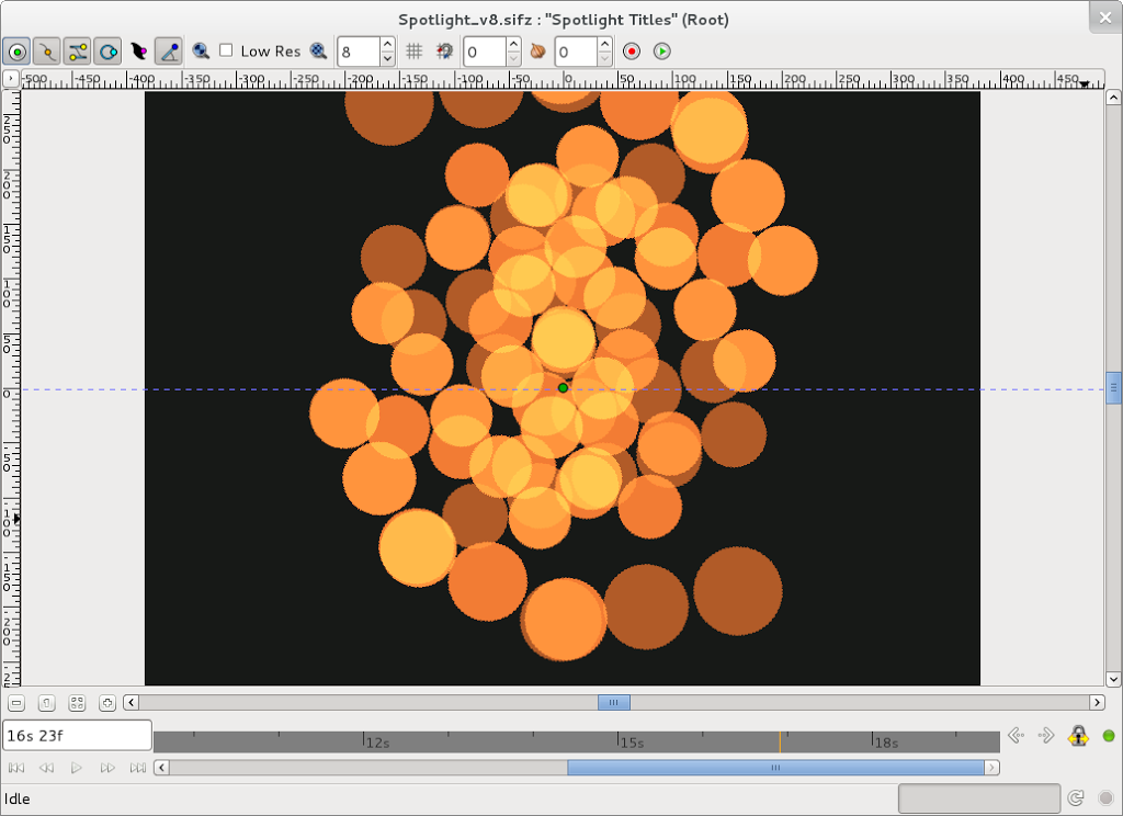
The ATV Today title sequence is mostly straightforward, as it uses techniques I’ve already used in the Spotlight South-West titles I created last year. However one thing I was not too sure about was how to key video onto the finished sequence.

Usually, when I have to create video keyed onto animation I cheat. Instead of keying, I make “cut-outs” (transparent areas) in my animation. I then export my animation as a PNG32 image sequence and play any video I need underneath it. This gives a perfect, fringeless key and was the technique I used for my News At One title sequence.

However, with this title sequence things were a bit trickier – I needed two key colours, as the titles often contained two completely different video sequences keyed onto it at the same time.

Two sequences keyed at once

Therefore I had to use chromakeying in Kdenlive using the “Blue Screen” filter, something I had never had a lot of success with before.

The first part was simple – I couldn’t key two different video sequences onto two different coloured keys at once in Kdenlive. Therefore I had to key the first colour, export the video losslessly (so I would get no compression artefacts), then key the second colour.

The harder part was making the key look smooth. Digital keying is an all or nothing affair, so what you key tends to have horrible pixellated edges.

Very nasty pixel stepping on the keyed video

The solution to this problem was obvious, so it took me quite a while to hit upon it! The ATV Today title sequence is standard definition PAL Widescreen. However, if I export my animation at 1080p HD and do my keys at HD they will have much nicer rounded edges as the pixels are “smaller”. I can then downscale my video to standard definition when I’ve done my keying and get the rounded effect I was after.

Smooth keying, without pixel stepping

The other thing I found is that keying in Kdenlive is very, very sensitive. I had to do lots of test renders on short sections as there was only one “Variance” setting (on a scale between 1 and 100) that was exactly right for each colour.

So now I was convinced I could actually produce the sequence, it was time to start drawing. I created all of my images for the sequence in Inkscape, which is a free software vector graphic tool based around the SVG standard.

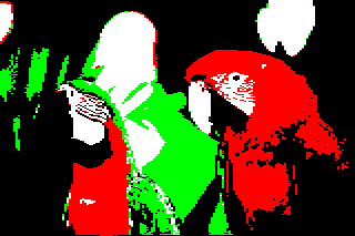
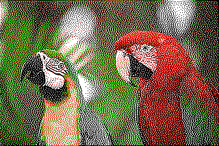
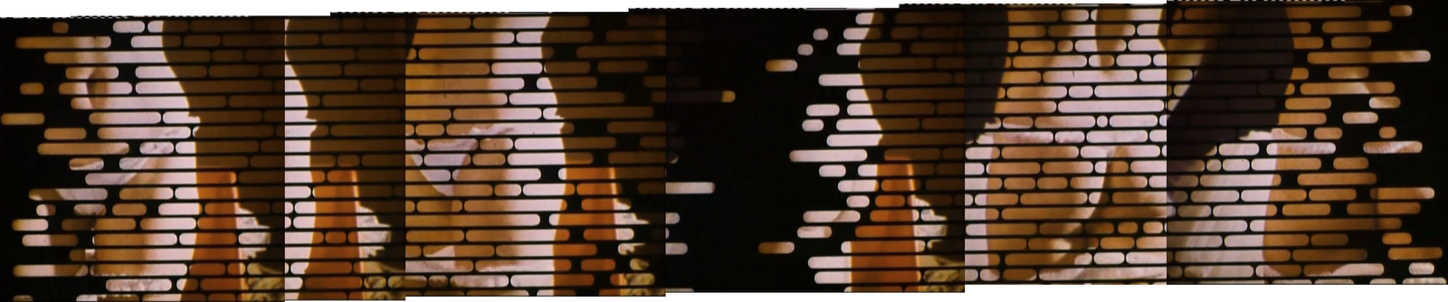
However, in order to produce images in Inkscape I needed to take source images from the original video to trace over. I used Avidemux to do this. The slit masks that the film sequences are keyed on to are about four screens wide, so once I had exported all the images I was interested in I needed to stitch them together in the free software image editor The GIMP. Here is an example, picked totally at random:

She’ll catch her death of cold…

Back in Inkscape I realised that the sequence was based around twenty stripes, so the first thing I did before I created all the slit mask images was created guides for each stripe:

These guides saved me a lot of time

The stripes were simply rounded rectangles that I drew in Inkscape. It didn’t take long to trace all of the slit masks for the title sequence. Two of the masks were repeated, which meant that I didn’t have as many graphics to create as I was fearing.

Once the slit masks were out of the way I could create the smaller items such as the logo:

ATV Today logo created in Inkscape

And, with that, all the Inkscape drawing was done. It was time to animate my drawings now, so I needed to export my Inkscape drawings into Synfig Studio. To do this I was able to use nikitakit’s fantastic new Synfig Studio SIF file Exporter plug-in for Inkscape. This does a fabulous job of enabling Inkscape artwork to be used in Synfig Studio, and it will soon be included as standard in Inkscape releases.

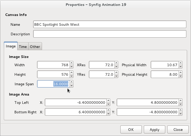
When I did my Spotlight title sequence I exported (saved) all of my encapsulated canvases (akin to Symbols in Flash) that I needed to reuse within my main Synfig file. This was probably because I came to Synfig from Macromedia Flash and was used to the idea of having a large file containing all the library symbols it used internally.

I have been playing with Synfig Studio a lot more since then, and I realised a far more sensible way to work was to have each of what would have been my library symbols in Flash saved as separate Synfig files. Therefore I created eight separate Synfig Studio files for each part of the sequence and created a master file that imports them all and is used to render out the finished sequence.

The project structure

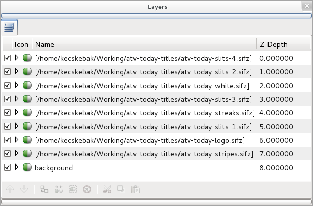
This meant that my finished sequence was made up of nine very simple Synfig animation files instead of one large and complicated one.

The animation itself mainly consisted of simply animating my Inkscape slit masks across the stage using linear interpolation (i.e. a regular speed of movement).

I could type my key-frames from my key-frame text file directly into the Synfig Studio key-frame list:

Key-frames for one part of the animation

The glow was added to the ATV Today logo using a “Fast Gaussian Blur”, and the colour was changed using the “Colour Correct” layer effect – exactly the same techniques I used in the Spotlight South-West titles.

ATV Today logo in Synfig

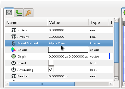
In order to improve the rendering speed I made sure I changed the “Amount” (visibility) of anything that was not on the stage at the present time to 0 so the renderer wouldn’t bother trying to render. You do this using Constant interpolation so that the value is either 0 or 1.

I had a couple of very minor problems with Synfig when I was working on this animation. One thing that confused me sometimes was the misalignment of key-frame symbol between the Properties panel and the Timeline.

This misalignment can be very confusing

As you can see above, the misalignment gets greater the further down the “Properties Panel” something appears. This makes it quite hard at times to work out what is being animated.

Some very odd Length values indeed!

Another problem I had was that the key-frame panel shows strange values in the time of length columns – particularly if you forget to set your project to 25 frames per second at the outset.

However, overall I think Synfig Studio did brilliantly, and I would chose it over Flash if I had to create this sequence again and could choose any program to create it in.

The most important technical benefit of Synfig Studio for this job was the fact that it uses floating point precision for colour, so the glows on the ATV Today logo look far better than they would have done in Flash as the colour values would not be prematurely rounded before the final render.

I rendered out my Synfig Studio animation as video via ffmpeg using the HuffyUV lossless codec, and then I was ready to move onto Kdenlive and do the keying.

Obviously I needed some “film sequences” to key into the titles, but I only have a small selection of videos as I don’t have a video camera. To capture video I use my Canon Ixus 65, which records MJPEG video at 640 x 480 resolution at 30fps.

My 16mm film camera

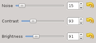
Bizarrely, when the progressive nature of its output is coupled with the fact it produces quite noisy pictures, I’ve found this makes it a perfect digital substitute for 16mm film camera!

I “filmised” all the keyed inserts, so that when they appear in the sequence they will have been filmised twice. Hopefully, this means I’ll get something like the degradation in quality you get when a film is then transferred to another film using an optical printer.

Once the keying was done the finished sequence was filmised entirely using Kdenlive using techniques I’ve already discussed here.

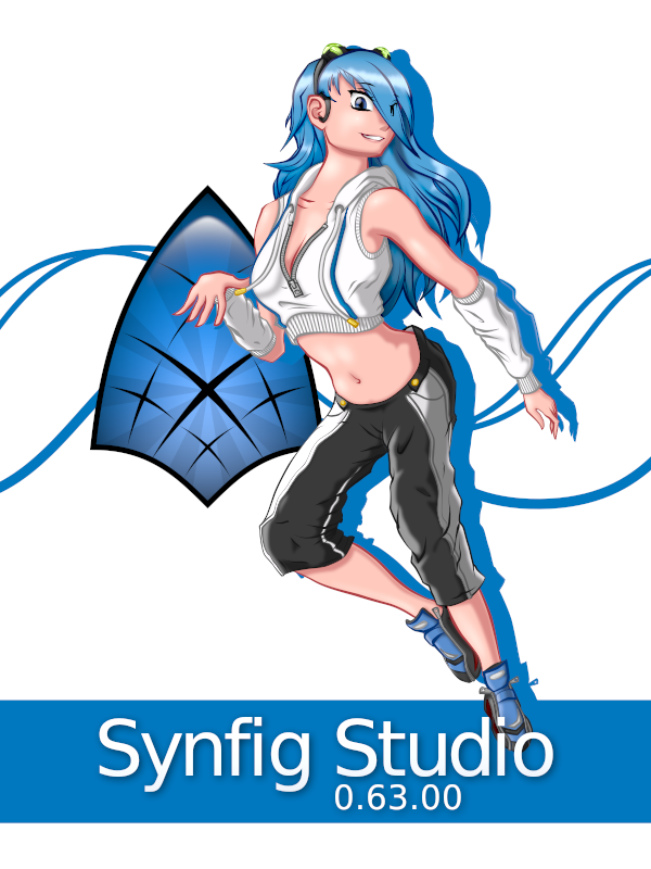
And so, here’s the finished sequence:

Although I’m not happy about the selection of clips I’ve used, I’m delighted with the actual animation itself. I’m also very pleased that I’ve completed another project entirely using free software. However, I think the final word should go to Roddy:

Thanks for the link. I had a bit of a lump in my throat, seeing those titles scrolling across, hearing the music, while munching on my Chicken and Chips Tea… blimey, I was expecting Crossroads to come on just after!

If you are interested in ATV, then why not buy yourself a copy of the documentary From ATV Land in Colour? Three years in the making, over four hours in duration, its contains extensive footage (some not seen for nearly fifty years) and over eleven hours of specially shot interviews edited into two DVDs.

Sunday’s Newcomers

Click to enlarge

Going through my old Flash files, I stumbled across an early version of this image, which I first produced in 2005. I didn’t know how to make it look realistic then, but I’ve since been given lots of good advice from Rory Clark. This new version was produced in Inkscape and aged in The GIMP.

In case you’re wondering, these were all real IBA Transmitters.

Cheap Dirty Film

Three years ago I talked about the programs I used to simulate old 16mm film. Back in 2008 I was using Windows XP, Adobe Premiere Elements 4.0 and a VirtualDub filter called MSU Old Cinema. I found I could use them to create some half-decent 16mm film:

These days I’m using Fedora 15 as my operating system and Kdenlive as my off-line video editor. That meant I’ve had to change the way I simulate old film quite a bit. I have been continuing to use VirtualDub and the MSU Old Cinema plug-in via WINE. Although VirtualDub is free software, the MSU Old Cinema plug-in is not, and this bothered me. I wondered what I could achieve in Kdenlive alone and I started experimenting.

In the course of this blog post I’m going to use the same image – an ITV Schools light-spots caption from the 70s that I recreated in Inkscape. Here’s the original image exported directly from Inkscape as PNG:

Created in Inkscape

The most obvious sign that you are watching something on a bit of old film are the little flecks of dirt that momentarily appear. If the dirt is on the film itself it will appear black. If it was on the negative when the film is printed it will appear white.

Kdenlive comes with a Dust filter that tries to simulate this effect. However, it has a very small database of relatively large pieces of dirt. In total there were just six pieces of dirt, drawn as SVG files, and that limited number led to an unconvincing effect. If I used the filter on a long piece of video I found I began to recognise each piece! There were also no small bits of dirt.

I drew 44 extra pieces of dirt in Inkscape and added them to the Dust filter. I also redrew dust2.svg from the default set. I call this particular piece of dirt “the space invader” as I found it was too large and too distracting!

The video below compares the Dust filter (with identical settings) before and after I added my extra files:

You may find you prefer the Kdenlive dust filter with just the default six SVG files. However, if you prefer what I have done you can download my extra SVG files from here.

With the modifications I’ve made, I actually prefer the dirt created by the Dust filter in Kdenlive to the dirt you get in the MSU Old Cinema plug in. The dirt from Kdenlive’s filter is less regular in shape and simply by changing the SVG files in the /usr/share/mlt/oldfilm folder I can tailor the dust to any specific application I have in mind.

After flecks of dirt, the second most obvious effect that you are watching old film is a non-uniform shutter causing the picture to appear to flicker very slightly. The MSU Old Cinema plug-in can simulate this effect, but wildly over does it. It is not suitable for anything other than simulating silent movies, so I never used it.

Luckily the Kdenlive Old Film plug-in does a much more convincing job. The settings that I found worked for me are shown below:

KdenLive Old Film settings for uneven shutter

And they create the results shown below:

It looks a bit odd on it’s own, but when added to all the other effects I’m describing here it will look fine.

I’ve noticed that when I am creating these effects it’s best if I move away from the monitor to a normal TV viewing distance to see how they look – otherwise I tend to make the effects too subtle to be noticed when I come to watch the results on my television!

The next thing that will help to sell the output as film is having some film grain. Film grain is irregular in shape and coloured. In fact, I used the Colour Spots setting of the MSU Noise filter to create film grain in VirtualDub.

Kdenlive has a Grain filter, which simply creates random noise of 1 pixel by 1 pixel in size. Although technically this is not at all accurate, it can look pretty good if you are careful.  The settings for film grain will vary from job to job, so some trial and error is involved.

As a starting point, these settings are good:

Kdenlive Grain settings

And will look like this:

Again, it looks odd by itself (and you can’t really see it at all on lossy YouTube videos!) but it will look fine when added to the other effects. You’ll start to notice the rendering begin to slow down a bit when you have added Grain! Incidentally, Grain is still worth adding even if YouTube is your target medium because it helps break up any vignette effect you add later.

The next thing you need to do is to add some blur – edges on 16mm film in particular tend to be quite soft. Kdenlive has a Box Blur filter which works just fine for blurring. How much blur you add depends on your source material, but a 1 pixel blur is fine as a starting point.

Colour film is printed with coloured dyes, so it has a different colour gamut to the RGB images you create with The GIMP, Inkscape or a digital video camera. In addition, it also fades over time. Therefore to make computer-originated images look like film-originated images some colour adjustment is normally required.

Luckily, Kdenlive has a Technicolor filter that allows you to adjust the colours to better resemble film.

Kdenlive Technicolor settings

The way colour film fades depends on whether it has been kept in a dark or light place. If I’m recreating a colour 16mm film that has been stored safely in a dark tin for many years, I make it look yellowish. If I’m recreating a colour 16mm film that’s been left out in the light a bit too much I make it look blueish. Both these looks rely adjusting the Red/Green axis slider – not the Blue/Yellow axis slider as you might think!

Source image faded with Technicolor

You soon begin to notice that the telecine machines used by broadcasters could adjust the colours they output to make colours that were impossible to resolve from the film. For instance, some of the blue backgrounds on ATV colour zooms were too rich to have been achieved without some help from the settings on the telecine machine. So the precise colour effect you want to achieve varies from project to project, and sometimes you will be actually increasing colour saturation rather than decreasing.

The Technicolor filter is, ironically, the filter you use to make colour source material monochrome too!

The biggest problem when trying to recreate old film is recreating gate weave – that strangely pleasing effect whereby picture moves almost imperceptibly around the screen as you watch.

MSU Old Cinema created an accurate but very strong gate weave which was too severe for recreating 16mm film. The Kdenlive Old Film filter has what it calls a Y-Delta setting, that makes the picture jump up and down by a set number of pixels on a set number of frames. It’s easy and quick (a Y-Delta of 1 pixel on 40% of frames is good) but introduces black lines at the top of the frame and is so obviously fake it won’t really fool anyone!

So there is, sadly, no quick way to create gate weave in Kdenlive. However, the good news is there is a way, provided you’re prepared to do a bit of work. You need to use the Pan and Zoom filter. The Pan and Zoom filter is intended to do Ken Morse rostrum camera type effects – it’s particularly good if you have a large image and want to create a video to pan around it.

However, what we can do is use the Pan and Zoom filter to move the frame around once per second. Firstly you zoom the image in by 108%. This means you won’t see any black areas around the edge of the frame as the picture moves around.

First of all, zoom the image very slightly

Next, you create key frames on each second:

Then add one key frame per second

Then you move the image around slightly on each keyframe – plus or minus two or three pixels from the starting position is often plenty.

Obviously, for a 30 second caption that’s 30 keyframes and 30 movements – a lot of work if done “by hand”. However it won’t go to waste, as you can save your Pan and Zoom settings as a Custom effect and resuse it again and again on different clips.

And, luckily, doing all this by hand isn’t even necessary. Custom effects are stored as simple XML files in the /kde/shared apps/kdenlive effects folder so it is possible to write a small Python script to automatically create as much gate weave as you want – something I’ll come back to.

As well as gate weave, you can also use the Pan and Zoom filter to stretch the frame, which is perfect for simulating stretched film. Again, that’s hopefully something I’ll return to another time.

Here’s an example of video moving with the Pan and Zoom filter:

The Pan and Zoom filter also adds hugely to your rendering time, so it’s best to switch it off until you do your final render.

Glow is a very important effect to add when simulating film, particularly monochrome film. Kdenlive does not have a glow filter, so if I need to add glow to a video file I have to improvise. I export the video as a PNG sequence, add glow to the PNG files using a GIMP batch script (written in Scheme), and then reimport the video file. It’s worth the effort, as it’s amazing how much glow helps to sell something as being originated on film.

Glow added using The GIMP

The GIMP glow filter tends to be rather harsh, and tends to wash out images if you use too much glow. Therefore you have to experiment a lot.

Finally, there is often uneven brightness or contrast visible across a film frame. In VirtualDub I used a filter called the Hotspot filter. The hotspot filter is actually designed to remove this effect from old film, but turned out to be just as good at putting the effect in!

However, with Kdenlive, this effect is best achieved in the GIMP when required as Kdenlive’s Vignette effect is too unsubtle to be of any real use.

So, put it all together, and you get something like this:

All in all, Kdenlive does a pretty good job of making digitally originated images look like 16mm film but although there is room for improvement. The film scratches filter needs work, there is no glow and the film grain is really just noise rather than grain. However you can still get some excellent results and I’m really pleased with it.

Spotlight on Synfig

The only thing I haven’t been able to do using free software since moving to GNU/Linux in 2008 is animate. And it bugged me. Everything else – raster graphics, vector graphics, offline video editing, audio editing, font design, desktop publishing – I could achieve, but animation was the reason I’ve had WINE and Macromedia Flash 8 installed on my machine for the past three years.

When I first started playing with GNU/Linux I came across a program called Synfig Studio which could do animation, but at that time it needed to be compiled from source code. It seemed a bit too much like brain surgery for a GNU/Linux beginner! However, the other day I was banging my head trying to do some animation in Flash. I decided to Google for any free software tools that might be able to help and I was reminded of Synfig Studio once again.

Blue hair? Why, it’s Mrs. Slocombe!

I went to the Synfig Studio website and the first thing I noticed was that a brand new shiny version of Synfig Studio was available as an RPM for Fedora. In other words, all I had to do was download, double click and go. Everything worked perfectly. I found the Synfig Studio website was excellent, there were a large number of tutorials and an extensive manual and so I set about reading.

Animation programs are always off-putting to beginners due to their complexity, and Synfig Studio was no exception – partly because it began life as an in-house tool in a professional animation company and that really shows in the power and complexity of what it offers.

I learned Flash 2 back in 1998 by trying to create the ATV Colour Zoom ident as I thought it would be quite a good challenge and force me to look into the tool properly. For the same reason I dusted off one of the more challenging animations in my “TODO” list to learn Synfig – the BBC South West Spotlight dots titles.

My plan was to draw the Spotlight logo in Inkscape, import that into Synfig Studio and then animate it. The first thing I did was set up my canvas. Changing the units to pixels is very important – Synfig Studio uses points by default which seems a strange choice for a tool not centred on printed work.

When I tried importing my artwork from Inkscape it came in at the wrong size:

Imported SVG from Inkscape

The reason was obscure and not what I had been expecting. I had assumed it was the old Inkscape dpi (dots per inch) problem, but it was to do with something called Image Span which is related to the aspect ratio of the end animation. After reacquainting myself with Pythagorean theorem I worked out I needed to set the Image Span to 16 for 768 by 576 pixel artwork from Inkscape.

Setting Image Span in Synfig Studio

Then artwork comes in correctly from Inkscape. However, now I could see some problems with imported SVG:

Problems with Imported Inkscape SVG

There were two problems – the holes had disappeared in the “P” and “O” and there was a segment missing from the circle of the letter “O”.

Paths with holes are imported into Synfig Studio as two objects or “layers” (everything in Synfig Studio is a layer) – the letter and its hole. To make a letter with a hole in it you need to place the hole layer above the letter layer, and then give the hole a layer an “alpha over” blend method. As you can see, the logic behind the program is very different to Flash!

Using Alpha Over in Synfig

The nick out of the letter “O” was Inkscape’s fault. When you convert text to paths in Inkscape you often get double nodes (nodes stacked on top of each other). Double nodes also cause problems in Inkscape itself so it’s always a good idea to merge these nodes in Inkscape.

The join nodes button in Inkscape

Inkscape ellipses don’t import as Synfig Studio circles (they come in as something called Blines instead), so I redrew the dots in the Spotlight logo as Synfig Studio circles to make animation easier later. In fact to get an ellipse in Synfig Studio you draw a circle and then apply a transformation layer to it – again, a bit strange for a beginner! So, now I had the artwork imported:

Inkscape SVG imported perfectly

I discovered I didn’t actually need the background rectangle I’d drawn in Inkscape in Synfig Studio, there’s a special type of layer for solid backgrounds called “Solid Colour” that always fills the background however large your animation is. This is analogous to “Background Colour” in Flash, only in Synfig Studio you could use a “Gradient” instead.

Now I needed to colour my artwork. I found a small bug in Synfig Studio which means that you cannot use the HTML-style RGB value (a six digit hexadecimal number) to enter colours. My background colour in hexadecimal was #171a17. When I entered this into Synfig Studio I got a mid grey, instead of the charcoal colour I was expecting.

A Lighter Shade of Dark

I went into the GIMP and discovered that #171a17 is equivalent to the the RGB percentages 9% 10% 9%.

The GIMP Colour Picker information dialog

I entered the values 9%, 10%, 9% into the Red, Green and Blue spinboxes on the Synfig Colours dialog box, and I got the colour I expected. However, I also found that the HTML code displayed on the Colours dialog became 010101 – not what I expected!

In Synfig Studio, the HTML code is wrong

The ever-helpful Genete on the Synfig Studio Forums suggested that I might have a non-linear palette selected for my file, but this turned out not to be the case. So the moral of the story is, sadly, only enter colour values as RGB percentages.

Speaking of colours, it would be great if Synfig Studio could load GIMP palettes, or create a palette from the currently imported layers.

I then set about animating. This is quite different to Macromedia Flash as in addition to “keyframes” you also have the concept of “waypoints”. A “keyframe” stores every setting of every “layer” item on the current canvas at a particular point, whereas a “waypoint” just stores one setting. You also have to forget about the concept of “frames” that was so key to Macromedia Flash. Synfig Studio, in common with Swift 3D, uses the concept of time instead. As far as the time-line was concerned I am very glad that I had done some work in Swift 3D before approaching Synfig Studio.

Keyframe labels appear on the canvas too

One thing I did like is the fact you could label not only your layers but your keyframes – that saved me an awful lot of scribbling! Once you have your keyframes set up Synfig Studio really excels. There are numerous different ways of defining how the animation gets from one keyframe to another. The default was TCB which gives beautiful naturalistic movement, but for Spotlight it would cause arcing like this:

Arc caused by TCB Interpolation

When I really wanted linear tweening to give me straight edges like this:

Corrected by Linear Interpolation

Another little gotcha I found whilst animating was that the time-lines starts at “0f”, not “Frame 1” as in Flash. This caught me out when I was putting the animation together as I was getting odd blank frames!

Whilst animating I came across a niggle caused by my operating System. In GNU/Linux Alt and left-click is used to move windows around. However, in Synfig Studio Alt and left-click is used to transform (i.e. scale) objects. Fedora 15’s deskptop GNOME 3 compounds this problem by removing the “Windows Movement Key” setting that you could adjust in Gnome 2 to change this behaviour. Fortunately the wonderful Synfig Studio forum came to the rescue as “nikolardo” had a cunning work-around:

“Another workaround for the Alt issue presents itself when you realize it only happens when you Alt-click. Pressing Alt and then clicking gets picked up by the WM (openbox, in my case), but clicking on a vertex and then holding the Alt key produces the scaling behavior intended. So, next time you Alt-click and the window moves, let go, and then click-Alt.”

Whilst working I found that “Groups” were not what I expected at all. The purpose of Groups in Synfig Studio is to collect disparate items around your animation so they can be selected together. In fact, when creating the animation I never used any groups at all, although I can see how they would be useful on other animations.

I loved the fact I could enter a frame number e.g. 454 to move somewhere on the time-line and it got converted into seconds and frames. I tend to think in frame numbers and it’s great I don’t have to keep dividing by 25 and working out the remainder. This was a huge help when setting up keyframes.

Useful for creating guides at 0x and 0y

Another thing I found was I could use the Canvas Metadata window, which at first seemed useless, to adjust the guides. It would be even better if you could use pixels instead of internal units to adjust the guide positions in this window.

One thing I soon learned as I worked was that Synfig Studio’s canvas window is not always WYSIWYG, and the Preview Window isn’t always an accurate reflection of the end result either (but this is being rewritten for the next release) – you have to do a render in order to see how your final result is coming along. This is particularly true if you are using effects like Motion Blur. For instance, when the Spotlight S is rotating, this is what I get to see on the stage:

What you see in Synfig Studio…

Whereas this is what the end result looks like:

…is much more impressive when rendered!

Correction from Genete:

“That’s because your display quality settings were not set to high quality. There is a spin button on the top of the canvas that allows you to set the quality to 1 (better), instead of use 8 (worse) the default value. WYSIWYG is fully done always in Synfig Studio. The problem is that it takes some time to render complex effects like motion blur, duplicate layer, etc.”

For my renders I used a PNG sequence, and only rendered the frames I’d just worked on. One thing I noted when rendering is that the render progress bar and cancel button on the canvas window don’t work. In the future I would love it if a WebM render option was added to Synfig Studio, particularly given the popularity of YouTube.

Notice that zooms, blurs and colour corrections are layers.

As I’ve said before, in Synfig Studio everything is a layer. Not just every single shape but a whole host of other things such as colour changes, blur effects, tranforms. So, obviously the number of layers you get soon gets large and unwieldy. However you can “encapsulate” layers together into what are called “Paste Layers” and then deal with these encapsulated layers as one object.

The capsules show encapsulated layers

You may be thinking this sounds a bit like the Flash concept of having symbols, but it isn’t – yet. The encapsulated layers are still on the main canvas and therefore use the main canvas’s time-line. In order to use encapsulated symbols in a way analogous to Flash library symbols you need to “Export” the Paste Layer as a separate Canvas. It will then appear in the Canvas Browser.

The Canvas Browser

Now your capsule of layers is a canvas in its own right, with its own independent time-line and you can use it in a way akin to library symbols in Flash. As you work, you’ll find that the main canvas’s time-line gets cluttered with keyframes and waypoints, so it’s worth exporting encapsulated layers to simplify your work.

The only real downside of the Synfig Studio time-line design is shared by Swift 3D. It’s that you can’t add and remove things from your animation easily. If you want to “hide” something you have to set its amount to 0 and then you have to fiddle about with waypoints with constant interpolation in order to show it again. It seems too much work when you simply want to put things on and take things off of your canvas.

Exporting a Paste Layer after you have already done work on an animation needs some care. Key frames are not brought across to the new canvas, and the exported animation duration defaults to 5s (five seconds) which means you have to increase it to the right length manually. So, before you start work on an animation it’s better to decide upon its structure first. But that was always the case anyway!

One minor thing – I found that I could only remove things out of encapsulated layers by dragging and dropping which was not discoverable for me – I expected to find another way of doing it via a button of some kind too.

Put a space in an Exported Canvas name and…

Entering a canvas name with a space in gives a message telling you about the C++ standard type library throwing an exception – not something most cartoonists would find particularly helpful!

When adding an exported canvas from the canvas browser on your main canvas you can offset its start-point by any number of frames. However, the offset needs to be a negative number of frames to make it appear a positive number of frames later and a positive number to make it start earlier which foxed me for a bit too!

Anyway, enough moaning – these are only very minor points! What you should take away from all this is that with exported canvases I found I could work exactly the same way as I was used to in Flash.

This does the hard work in the Spotlight animation.

Meanwhile, back to my animation. I wanted to emulate some optical film effects in my animation. The first one, motion trails, was easy to do with the Synfig Studio Motion Blur layer. This gives you a huge amount of control over the appearance of your finished trail.

Software doesn’t get any more magical.

I also needed some “optical glow”. I achieved this very easily by using the Colour Correct layer. This actually had a setting for Over Exposure – the exact effect I wanted to emulate – built into it! I was absolutely amazed! And not only that, I could animate the Over Exposure setting too. Incredible.

A bit of Blur (of which there are a dazzling array) helped to sell the glow even more.

The range of effects you can add to your animations in Synfig Studio is truly overwhelming. I think I’ll be blogging for months about the huge range of things you can do in Synfig Studio. It is an enormous amount of fun.

Zoom layers are a very clever idea.

To zoom in and out I used, naturally enough, the Zoom layer. Having a zoom on a separate layer is incredibly sensible when you actually start using it, but seemed very odd at first appearance.

And, it goes without saying, moving the dots around the canvas in Synfig Studio was simplicity itself.

So, here’s the finished result:

Did I mention Craig Rich knew my Granny…

Synfig files are very small and compact. The final file size was tiny – 11.9KB. I found that utterly incredible and it compares very favourably to Flash.

I could have completed these titles in about two hours in Macromedia Flash 8, in Synfig it took me two days to learn the tool and complete the animation which I was quite pleased with.

Synfig is an excellent tool that is staying firmly installed on my computer! I really love using it and I am excited about what I can achieve using it in the future and the vast range possibilities it opens up. It is powerful, flexible, stable and rewards the effort you put into learning it a thousand times over. It also has a friendly and helpful community. Recommended.

You Know When You’ve Been Tango-ed

My friend Samwise and I are both enthusiastic users of the GNU/Linux operating system and also enormous fans of the incredible range of retro computing emulators produced by the brilliant Tom Walker.

Tom (left) and Samwise (right)
Photo courtesy regregex

There’s seemingly nothing that Tom isn’t able write an emulator for. He’s written emulators for everything from the humble Acorn Electron to the StrongARM-ed Risc PC with Spectrums, Amstrads, Beebs, Archimedes and much else in between.

Elkulator, running on Fedora 14

So it wasn’t altogether surprising when, last month, Sam asked if I could create some icons for his desktop he could use with Tom’s emulators.

Superior’s EGO:Repton4, running on RPCEmu

Sam is a KDE desktop power user, whereas I’ve always been a GNOME numpty. Fortunately for us starving scribblers and colourers in there is a project that aims to standardise all free software desktops and ensure we can create icons once that look good on all of them. The project is called the freedesktop project and the part concerning icons is called Tango.

There are numerous tutorials on the web that explain how to create Tango icons in both Inkscape and The GIMP.

The first icon I tried to create in Tango format was the three dimensional RISC OS era Acorn logo, to use with Arculator. Below, you can see the real Acorn logo on the left, and the “Tango”-ed version on the right.

More Tango-ed than Judith Chalmers

As you can see, the Tango version looks rather cartoonish – and the colours are rather muted and pastel. And the direction of the light source has been changed. This was all done deliberately and in order to follow the Tango guidelines.

Sam was happy with this icon and asked if I could create icons for all of the Acorn-related emulators. And that’s when sticking to the rules started to get a bit of a pain. For Tango icons, each icon should be a distinctive shape in order to help those with poor eyesight and each icon should also contain a metaphor as to the icon’s purpose.

However, for the emulators all that we really needed was a square icon with a logo that told you at a glance what computer you were using so the guidelines rather went out the window. The Tango colours were also very restrictive as far as what I could use so I just threw caution to the wind and did what I felt!

Here’s the Elkulator icon:

I really like the background grid, which was the trademark of the Acorn Electron.

Here’s the B-Em icon:

And here’s the RPCEm icon:

I also created some Archimedes artwork – here’s the Archimedes logo I created as an SVG file in Inkscape:

Click to enlarge.

Here it is “Tango”-ed!

And here are the full set of icons I created for Sam:

Click to enlarge

In future, when I have more time, I’ll create proper Tango themed icons for all of these emulators. I spent about two minutes on each of the icons above and it shows! This will require me to actually draw the systems being emulated and make sure that I’ve got a different shaped outline for each one.

So I’ll probably return to this topic when I’ve done some decent, real, Tango icons!

Coloured Sugar

Once I’d finished writing a range of BBC Micro Python-Fu image filters for The GIMP, the Amstrad CPC series seemed the obvious next computer to tackle.

The graphics capabilities of the CPC were very similar to those of the BBC Micro, but the CPCs benefitted greatly from having many more colours available. Everything you could ever want to know about the video capabilities of the Amstrad CPC range is explained here.

The graphics capabilities are so similar, in fact, that to create a graphics filter for Amstrad CPC in Mode 0 all I had to do was change the palette data in my BBC Micro Mode 5 filter. Instead of picking 4 colours from a range of 8 the filter simply needs to pick 16 colours from a range of 27.

So, here is a picture of Baron Sugar‘s beloved Hackney Empire (formerly the ATV Television Theatre):

ATV, Rediffusion and ABC all made programmes here

And here it is put through my Amstrad CPC Mode 0 image filter for The GIMP with no dithering:

Amstrad CPC, Mode 0, No Dither

Oh dear. Even the BBC Micro Mode 2 filter seemed to be able to do better:

BBC Micro, Mode 2, No Dither

Here’s the Amstrad CPC Mode 0 filter with 2×2 threshold matrix:

Amstrad CPC, Mode 0, Ordered Dither 2×2 threshold matrix

The BBC Micro Mode 2 version with a 2×2 threshold matix seems much flatter and less detailed:

BBC Micro, Mode 2, Ordered Dither 2×2 threshold matrix

So what went wrong with no dithering? Well, the method I’m using to choose a palette is very crude – it picks the sixteen most used colours from the Amstrad CPC palette to go into the final image. If my method is applied an image with lots of dark areas and a few highlights the highlights will be completely missing as the light colours will not be used enough to feature in the final table of 16 colours. I obviously need to find a method that takes into account the range of luminance used on an image.

The situation gets even worse when dealing with the Amstrad CPC Mode 1. Amstrad CPC Mode 1 is very similar to the BBC Micro’s Mode 1. But whereas Mode 1 on the BBC Micro can pick 4 colours from a selection of 8, Mode 1 on the Amstrad CPC can pick 4 colours from a selection of 27.

Here’s a picture of Polly parrot:

Pining for the fjords

Here’s the same picture put through the Amstrad CPC Mode 1 filter with no dithering:

Amstrad CPC, Mode 1, No Dither

Here’s the same picture of a parrot put through the BBC Micro Mode 1 filter with no dithering.

BBC Micro, Mode 1, No Dither

Even Sierra3 error diffusion won’t help the Amstrad CPC Mode 1 image:

Amstrad CPC, Mode 1, Sierra 3 Error Diffusion

Whereas the BBC Micro filter produces excellent results:

BBC Micro, Mode 1, Sierra 3 Error Diffusion

Needless to say, the Amstrad CPC filters should be producing better results than the BBC Micro filters!

So, I’m going off to find a better way to pick an Amstrad palette! In the meantime, if you want to play with the Amstrad CPC filters they can be downloaded from here. Microsoft Windows users can find out how to install and use the filters with The GIMP by following the very nice set of instructions with pictures I’ve found here.

A la Mode

Time for another chapter in the continuing story of producing Python-Fu retro computing image filters for The GIMP from some original programs in sdlBasic by nitrofurano.

In my last post I talked about ordered dithering, and how it compared to the error diffusion technique I had implemented previously. After successfully implementing ordered dithering the natural next step was to incorporate the ordered dithering into my BBC Micro Mode 2 image filter so that all the image processing techniques were available in one filter.

Finished filter interface

Whilst doing this, I also made the Strength slider in my BBC Micro filter act upon Ordered Dithering as well as Error Diffusion. This allows for some quite interesting effects.

Here is John Liven’s Somerset cottage picture. I’ve applied Ordered Dithering with a 2×2 threshold matrix set to 100% strength:

Mode 2, 2×2 Ordered Dither, 100% Strength

And here is the same picture with the same dithering applied at just 50% strength:

Mode 2, 2×2 Ordered Dither, 50% Strength

Once this was done the BBC Micro Mode 2 filter was finally finished off. I then turned my attention to writing a BBC Micro Mode 5 filter. Mode 5 is very similar to Mode 2, but you can only use 4 colours from a selection of 8.

This means the image filter needs an additional step in which the palette to use for the image is selected. The way I approached this was to scan the entire image pixel by pixel tallying which of the 8 possible BBC Micro colours each pixel was closest to. Then, I simply used the four most commonly found colours.

Incidentally, the way you work out how close one colour is to another is quite simple once it’s explained to you: I found the answer here.

After a coding a bit of Python I loaded an image of some parrots into The GIMP:

Norwegian Blue is on the left

And tried out the filter with no dithering. It worked first time:

Mode 5, No Dithering

And when some Sierra3 error diffusion was added too, the results were incredibly good:

Mode 5, Sierra 3 Error Diffusion 100% Serpentine

I still can’t get over the fact that there are just four colours (black, white, red and green) in this image.

With a Mode 5 filter under my belt it was very easy to produce a Mode 1 filter. Mode 1 is the same as Mode 5, but has square pixels:

Mode 1, Sierra 3 Error Diffusion 100% Serpentine

And a Mode 4 filter. Mode 4 is like Mode 1, but is restricted to just two colours:

Mode 4, Sierra 3 Error Diffusion 100% Serpentine

So, I have got a pretty nice suite of BBC Micro image filters, with only Mode 0 to add. As always, you can download them from here. Microsoft Windows users can find out how to install and use the filters with The GIMP by following the very nice set of instructions with pictures I’ve found here.

What A Ditherer

I’ve spent a lot of time recently converting nitrofurano‘s sdlBasic retro computing picture converter programs into Python-Fu image filters for The GIMP. I’ve also been adding a few ideas of my own – particularly in the area of half-toning techniques.

After successfully getting Error Diffusion working, I decided to see if I could get Ordered Dithering working. Ordered Dithering is a technique akin to the half-toning you see on images in newspapers. From an image made up of many colours you can create an image made up of only a handful of colours stippled such a way as to give the illusion of many colours.

There are several excellent explanations of Ordered Dither on the web for the curious written by people who actually know what they are talking about – I would recommend this one and this one.

Ordered Dithering is much simpler than Error Diffusion (which is probably why it took me longer to get it working!). As it’s a much simpler process it’s lightning fast in comparison, even when coded in Python.

As a test, I took John Liven’s picture of a Somerset cottage. 

Photo: John Livens

Then I converted the image to the BBC Micro‘s MODE 2 (which has just eight colours) using an ordered dither with a 2 x 2 threshold matrix.

BBC MODE2, Ordered Dither, 2×2 matrix

As you can see above, it produces a very pleasing regular patterning on the colours – to allow you to compare, here is the same image with Floyd-Steinberg Error Diffusion:

BBC MODE2, Floyd-Steinberg Error Diffusion

On a small image such as this, larger grids don’t really add much. Here is an ordered dither using a 4 x 4 threshold matrix:

BBC Micro MODE2, Ordered dither, 4×4 matrix

But, the proof of the pudding is in the eating. If you have The GIMP installed on your computer you might like to try the ordered dither filter for yourself – it’s available from here.

BBC on the BBC

Over the past few days I’ve been converting nitrofurano‘s image filters from stand-alone sdlBasic programs to Python-Fu image filters for The GIMP. But, so far, there has been a particularly noticeable absence – the BBC Micro.

Partly that was because the BBC Micro world has already been utterly spoilt in the image conversion department by Francis G. Loch‘s incredible BBC Micro Image Converter. It’s a highly professional piece of software and does it all. I’ve posted about it many times here and the work I’ve done for Retro Software would have been utterly impossible without it.

BBC Micro Image Converter by Francis G. Loch

But partly it was because Francis’ program had inspired me to try and find out more about the mind-boggling array of dither options he had included in his program. It boasted a host of exotic sounding names like “Floyd-Steinberg”, “Sierra”, “Jarvis, Judice and Ninke” and “Stucki”.

Paulo had used a technique called Bayer ordered dither in his filters, which is similar to the traditional half-toning used in print. It’s very powerful, very fast and gives you a lovely regular patterned effect on the images, which is sometimes just what you’re after.

Naturally, Francis’ BBC Micro Image Converter does this as well. But these exotic sounding names were the inventors of various flavours of another technique: error diffusion.

Error diffusion works by trying to compensate for the colour information lost by turning a pixel into a value from a restricted palette by sharing it out amongst the surrounding pixels.

After looking at the Wikipedia entry for Floyd-Steinberg, it looked like even I could understand how to program it and then after finding an excellent article here I realised that all the other filters did exactly the same thing. They just shared out the lost information (or quantisation error) to different pixels in different proportions.

And, after a couple of hours messing about in Python, I managed to get out a servicable MODE 2 image (click on the images to enlarge):

Floyd-Steinberg error diffusion, 100% strength

You can see just how effective error diffusion is when you compare the results to the same image processed with no error diffusion:

The same image with no error diffusion

Here’s the original image for comparison:

I’m the one on the right

I excitedly added a range of different filters into my BBC Micro image filter:

Take your pick!

There was a problem though. Sierra3 was taking well over 70 seconds. This sluggishness was caused by the inefficient way in which I was checking that a pixel was within a certain range in Python.

Sierra3, 100% Strength – and very slow!

An error message I had been getting during development rather ironically proved to be the key to solving the speed problem. Instead of using time consuming range() functions to see if pixels were inside a particular range, I could use exception handling and check for an IndexError instead. This was very fast – it sped the filter up by a factor of at least four. Mind you, it still crawls along compared to Francis’ version!

The next thing I needed to add to the filter was something called “Serpentine parsing“. This means that instead of processing the image from left to right as it moves down, the computer processes the image backwards and forwards. This helps to stop all the error diffusion going in just one direction – smearing all the errors to the right.

Finally, pinching another one of Francis’ excellent ideas, I added a strength control to the filter to allow you to control how strongly the error diffusion works.

Finished interface

Here is Test Card F with 50% Floyd-Steinberg error diffusion strength:

Floyd-Steinberg error diffusion, 50% strength

And here it is with 25% Floyd-Steinberg error diffusion strength:

Floyd-Steinberg error diffusion, 25% strength

So, a BBC Micro Mode 2 image filter for The GIMP, that can be downloaded from here. However there are numerous refinements that need to be added to it. But they will have to wait for another day.

Test Card F Copyright © 1967 BBC, ITA and BREMA.

If you see SID, tell him…

I’ve converted nitrofurano‘s sdlBasic Commodore 64 Low Resolution mode picture converter into a Python-Fu image filter for The GIMP.

In Commodore 64 Low Resolution mode, each block of 4 x 8 2:1 aspect ratio pixels can contain four colours from a choice of 16.  Only, it’s a bit more complicated than that! Fortunately, this article explains how it is supposed to behave very nicely. Paulo’s algorithm has to go through eight separate stages to create the finished image.

The main novelty for me in this filter was that in order to avoid having to use a three dimensional list (which would have entailed syntax to boggle the mind) I used a Python new-style class. That meant I could use a one dimensional list and let the class take care of getting and setting the right bit of it when required through method calls.

Here’s an example image before:

Original scan

And after conversion in The GIMP using the filter:

Commodore 64 Low Res Filter

As usual this plug-in, along with ones for the ZX Spectrum, Apple II and MSX1 can be downloaded from here.