Replay Replayed

Replay Expo time is fast approaching again, which is why Barbara Kelly and Lady Isobel Barnett are pictured below modelling an original piece of my artwork:

Sadly, Doris Speed wasn’t free.

Replay Expo is an Arcade, Video Game and Retro show that takes place every autumn at the Norcalympia Exhibition Centre in Blackpool. Last year’s event attracted 3,200 visitors over two days and the organizers are hoping to attract 5,000 this time. The show is timed to coincide with the last weekend of Blackpool Illuminations.

Last year I was involved in designing fliers, banners, advertisements and the website for the show and the organisers very kindly asked me if I would like to continue doing so this year.

r3play 2010

The first thing I needed to do was devise a “Replay” logo for this year’s event. The brief was “the same, but different”. The previous logo was originally designed by “Greyfox”, also known as the talented Irish graphic designer Darren Doyle. It was a beautiful logo and worked fantastically well so I wanted to keep as close to it as possible.

I had two main ideas. Firstly, I wanted make the logo a little more colourful, as the show will be a little more colourful this year. Secondly, I wanted to include a cartoony black outline around the lettering to increase the contrast from a distance and also to evoke the black outlines around cartoony video game characters.

In addition the logo had to be vector illustration, as I would need to export it at some very large sizes indeed. This meant I created it entirely in Inkscape.

This is what I came up with:

replay 2011 – click to enlarge

It was one of the only occasions I’ve ever got it right first time! You’ll notice I had to reverse the “E” because last year people insisted on calling the previous event “are three play” which rather upset the organizers!

B790 – I’m sure this face has a real name!

Next was the question of typography. Last year was easy – I was using lots and lots of lovely Microgramma. This year it was again “the same, but different”, so I settled on a Hermann Berthold art deco typeface called B790. This was similar enough to Microgramma that I could use it in the same sort of ways, whilst at the same time looking very different.

The one thing I was disappointed about this year was the design of the 2011 lettering. I spent day after day producing draft after draft:

My favourite – I spent hours on this!

Another massive fail

Obviously massive fails come in threes

However, in the end nothing I produced seem to grab the client – something that was entirely my fault. In the end, with half an hour or so to spare before stuff went needed to go off to the printers I gave up and produced something quick I’m really ashamed of.

At least the client liked it.

As you can see, the B790 ended up with a bit of a starring role as I used it for the word “EXPO”.

Producing the fliers and roll up banners for Replay Expo was rather interesting this year as the printers decided that only CMYK PDF files were acceptable. In previous years, they had accepted RGB TIFF files exported at 300dpi (dots per inch), which I could export from either The GIMP or Inkscape. But neither Inkscape nor The GIMP can currently produce CMYK PDF files. Therefore, after meaning to do so for nearly three years now, I finally had a good reason to grips with Scribus, a free software desktop publishing package.

The first thing I had to do was a lot of reading. The Scribus documentation is excellent and very thorough, so it was a pleasure to go through it all. Then I went through the tutorial. I had to do that when the children were at school as the first couple of hours featured a statue of a rather forgetful Indian lady who had absentmindedly neglected to put on her undergarments.

She’ll catch her death of cold…

Fortunately, I had colour management set up on my computer, so soft-proofing worked perfectly. This meant that whatever I saw on screen was very close to how my finished artwork would appear in print.

I produced my Replay logo artwork in Inkscape, and exported the logo as a 300dpi RGB PNG file for import into Scribus. Usually I could import my Inkscape files directly into Scribus, but in this instance I was using Inkscape layer effects (i.e. SVG image filters) that Scribus is currently unable to cope with.

Flier created in Scribus

I then created the text and frames directly in Scribus, and imported the photographs into them. It’s actually a very nice way of working as you are using each tool for what it does best.

Once finished, I could export my Scribus file as a CMYK PDF, send it off to be printed and hope for the best.

This was all completely new to me, and I was really nervous as to whether my exported PDF files would even be accepted by the printers, let alone print properly. What was worse was the fact that the Gadget Show Live event was two days away and there wasn’t time to do anything if my files were no good!

Anne Ladbury and Mary Morris

However, as you can see, they turned out quite well. Scribus is an excellent piece of software and I would recommend it to anyone.

Replay Expo takes place at the Norcalympia Exhibition Centre, Norbreck Castle, Blackpool on the 5/6 November 2011. Tickets for the event are available from http://replayexpo.com/tickets

Who needs Jimmy Savile?

The R3PLAY Arcade, Retro and Video Gaming Expo was held on the 6-7 November in Blackpool and, as I said a few days ago, it saw the official launch of Repton: The Lost Realms.

The visitors to the show had the poster I designed inflicted on them as they were queuing to get in:

Photo: Michael S. Repton

The Retro Software team were ready and waiting to sell millions of copies:

(Back L-R) Peter, Greg, Steve, Tom, Michael, Jonathan, (Front) Martin, Dave. Photo: Martin Barr.

Needless to say, the game completely sold out. And no wonder, the finished article looked gorgeous – in spite of the fact that I did all the artwork:

Kecske Bak, after Ellis Ives Sprowell

We were honoured that Repton took time out from running his HSE-free diamond mining conglomerate to attend in person:

Photo: Michael S. Repton

The Beeb performed masterfully:

Photo: Martin Barr

And so did its half brother by the milkman, the Acorn Electron:

The most impressive Acorn Electron Repton yet

Contributing to a real Repton release was a childhood ambition of mine – and one that, somehow, I’ve now managed to fulfil.

Paras Sidapara, Tom Walker, Michael S. Repton, Jonathan Parkin, Richard Barnard, Dave Moore, Peter Edwards, Andrew Weston, Richard Hanson, Matthew Atkinson, John Chesney and of course the durian munching genius polymath that is Tim Tyler all put a huge amount of work but most of all love into Repton: The Lost Realms and I think that really shows.

I’m really honoured I got to be a part of the team.

Designing Repton’s Lost Realms

If you’ve been here before, you’ll probably already know that this year is Repton‘s 25th anniversary. And, as part of the celebrations, Retro Software is releasing Repton: The Lost Realms for the BBC Micro and Acorn Electron.

I’ve already blogged about creating the cover artwork and the loading screen for the game. However today is the 6th November and Repton: The Lost Realms is being officially launched at R3PLAY in Blackpool. That means I can at last talk about creating the graphics for the game itself.

My cover artwork

I was first approached by Dave Moore about contributing to Repton: The Lost Realms in mid 2008. Peter Edwards had just recovered a load of my old Repton 3 and Repton Infinity screens from some of my 5.25″ floppies and the graphics in them had impressed Peter and Dave enough for them to ask if I would be interested in creating some screens and graphics for Repton: The Lost Realms.

Like Repton 3 before it, Repton: The Lost Realms is a game that allows you to not only edit its levels, but also redefine its graphics. That means that it’s possible to provide a selection of different screens and graphics for players to load into the game.

Lost Realms as I first received it

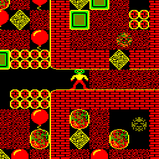
At this stage, the Repton: The Lost Realms came with only one set of screens. As you can see above, it used the Repton 3 graphics with a few additional graphics for the game’s new elements designed by the game’s original programmer Paras Sidapara.

As there were to be four sets of six screens included in the game, my first idea was to theme each set of graphics around the existing Repton releases. In other words, have a Repton 1 set…

Repton 1 Lost Realm

…a Repton 2 set…

Repton 2 Lost Realm

…a Repton 3 set…

Repton 3 Lost Realm

…and a new set for the final set of screens.

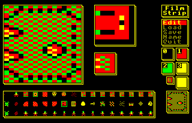
I quickly hacked about and transferred the graphics from these games into Repton: The Lost Realms. At this stage I was designing new characters in the Repton Infinity graphics editor (Film Strip) and then transferring them over to Repton: The Lost Realms by transferring blocks of data between files using the BBC BASIC command line.

Film Strip – An excellent graphics editor

The reason why I preferred Film Strip was that it was designed for use with a keyboard. I didn’t have a real BBC Micro to use so I was using these programs via the excellent emulator BeebEm. In fact, as at that stage there wasn’t a native GNU/Linux emulator for the BBC Micro at the time, I was using BeebEm via WINE.

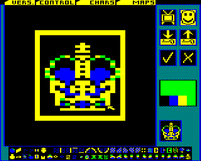
The Repton 3 and Repton: The Lost Realms editors had adopted the then very fashionable WIMP paradigm. However, using a WIMP interface with a keyboard is very hard going and I found the AMX Mouse option tricky to get working in BeebEm. That meant I couldn’t use these editors with my mouse.

Another problem I had with Repton: The Lost Realms’ editor was the awful yellow and black colour scheme used for the editor’s pointer. It was probably the worst colour scheme you could have picked if you want to design graphics precisely – the outline of the pointer gets lost against black, but most of the graphics have black backgrounds or outlines!

Repton: The Lost Realms’ Editor

After I had designed Repton 1 and Repton 2 themed graphics it soon became obvious that this approach would not work. There were various new elements in Repton: The Lost Realms that were not present in previous Repton games. I wanted to redesign these in each set to match the style of previous Repton releases. However Dave wanted to keep the new game elements that Paras had designed looking the way Paras had designed them. However this would have looked out of place, particularly in Repton 1 which is quite abstract and geometrical in design.

Therefore, after talking it over with Dave and Paras we decided it would be best if I design four completely new sets of graphics for the game, bearing in mind the need to keep the original design of Paras’ new game elements in each set. We would also only vary the game characters that varied in the sets of screens supplied with Repton 3: namely the walls, eggs, monsters and crowns.

I had a few ideas for the graphics having got used to playing the game. I didn’t think that the inverted cage colour scheme for the anti-clockwise spirits worked at all. I needed to find a way to make these cages look a little less incongruous. I wanted to make the graphics look 1988-ish – so I used the style of later BBC games like Richochet and Star Port as inspiration. And I wanted to use stippled colours as much as possible to make the apparent colour palette seem more than the four colours that the game was limited to.

I designed the set of graphics for the final set of levels (PRESTO) first. My inspiration for these were the full-page adverts for Repton 2 and Repton 3 that Superior Software used to run in Acorn magazines at the time. In particular, I wanted to design a set with light mortar between distressed bricks. I’m very proud of this set and I think it’s actually my favourite.

Presto – not for the faint hearted

I got a bit carried away, and I also redesigned Repton to look like he did in Superior’s adverts – this was very quickly and firmly rejected, and rightly so!

My Redrawn Repton went down like a cup of cold sick

I had one set down, three more in front of me and even using FilmStrip on a BBC Micro emulator seemed like very hard going. I really wanted to use The GIMP to design the graphics and suddenly it dawned on me that I could.

I could design the graphics in The GIMP and then transfer them to the BBC Micro emulator using the BBC Micro Image Convertor by Francis G Loch. This is an application written in PureBasic that takes image files (bmp, jpg, etc.) and downconverts them into the native screen display formats of the BBC Micro.

The process has a few stages. First I design all the graphics as separate files in The GIMP:

Completed graphics designed in The GIMP

Then I use the GIMP to slice them up and put them in rows:

Sliced and Diced in The GIMP

And finally I convert the graphic into BBC Micro format using the BBC Micro Image Convertor:

And converted to BBC Micro format

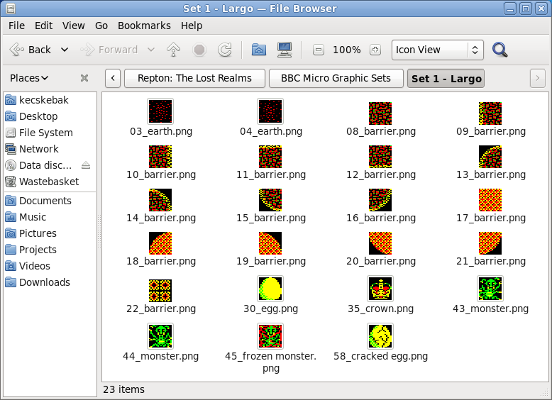
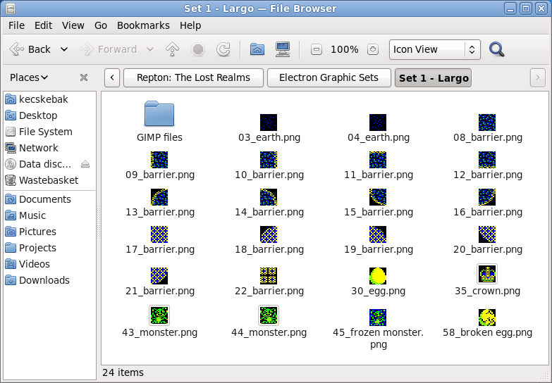
So, I fired up The GIMP and the next set I designed was for the LARGO set. This is the default set that loads when the game or editor loads, and the levels in this set were the original six levels designed by Paras Sidapara back in 1988.

Largo – the Realm of the Exile

Because I knew Paras was a huge fan of the game Exile, I decided to base the design of the walls on the walls found in Exile. This set looked very nice and thanks to The GIMP I was able to design them very quickly.

Adagio – Exile crossed with Repton 2

The third set I designed was a set for the ADAGIO screens. This set was a kind of cross between the walls found in Exile and the walls found in Repton 2 (my favourite Repton release). It didn’t work as well as I would have liked and I wish I’d done something a bit different.

Allegro – juicy, apparently…

The final set I designed was the ALLEGRO set. It was loosely based on the graphics for the game XOR, which my children were madly into playing at the time. This set has been described as looking “juicy”, whatever that means! Dave Moore accused me of taking a little more care over these graphics than some of the others because I knew I was designing all six levels to go with them. How very dare he!

The work on the graphics Repton: The Lost Realms was very straightforward. I did very little rework once we decided on what we were doing and there were only two real debates about the game characters. The first concerned earth, the second concerned fungus.

As far as the earth is concerned, I wanted to experiment with some dense Ravenskull style earth, whereas Dave Moore preferred the very sparse earth used in the Toccata level set of Repton 3. Dave got his way on that one!

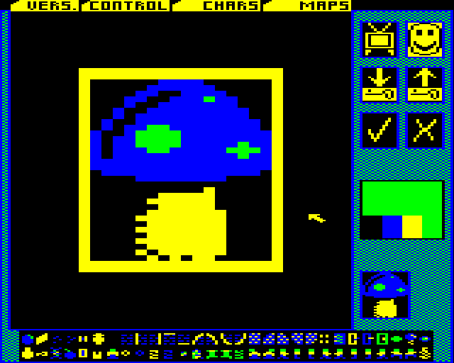
Now that’s what I call fungus!

The fungus debate concerned my preference for fungus that looked like a toadstool rather than the amorphous mould that was presented in Repton 3. In the end, I redesigned the fungus to look slimy rather than mouldy but it’s probably the graphic I am least happy with.

Now that’s what I call fun, Gus!

We also had a discussion about the “freeze pill”. This was a green pill that froze monsters temporarily. What with absorbalene pills and time pills I thought Repton’s drug habit had gone far enough.

Freeze pills – just say no.

 
I wanted to replace it with a Citadel style snowflake. Everyone agreed, and that also involved making changes to the editor and game map graphics which I did by hacking the code about. But, although my snowflake was a good idea, I think the graphic I designed was horrible.

Snow flake – just say yuck.

Once I’d designed all four sets, I thought that that was that – only it wasn’t. By this stage Tom Walker (someone for whom the word genius seems utterly inadequate) had joined the project, and had started work coding an Acorn Electron version.

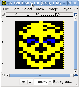
The Acorn Electron is cruelly afflicted in many ways, but one of the worst is that it has no hardware scrolling. That is terrible news for a game like Repton which relies on scrolling. Acorn Electron scrolling has to be done in software, which eats up the memory available for the game – and its graphics. The graphics in Acorn Electron Repton: The Lost Realms are 12 x 24 instead of 16 x 32 for the BBC Micro version.

Skull (Acorn Electron)

This meant I had to create cut down versions of all of the games’ graphics for the Acorn Electron version, and doing this took as long as it took to create the original graphics. In fact, I put in so much effort I actually prefer some of the Acorn Electron graphics.

Largo – All ready to transfer to Elkulator

Probably the most interesting thing about doing this was the lack of an Acorn Electron editor – or indeed an Acorn Electron version of the game itself! I had actually finished the graphics and put them in game files before Tom had finished coding the Acorn Electron version of the game.

It was quite some time after I had finished the graphics that I was actually able to play with the graphics in the game itself via Tom’s excellent Acorn Electron emulator Elkulator.

 Acorn Electron version

Keen eyed Repton fans will notice that Acorn Electron Repton: The Lost Realms reintroduces Tim Tyler‘s Repton sprite from Repton 2. I think this has much more personality than the one used in Repton 3.

I knew that there was a keen interest in the Repton: The Lost Realms from Acorn Electron enthusiasts so I put an enormous amount of effort in the graphics for the Electron version – I just hope they like them!

And finally –  a word about the design of the crowns. I spent many years living in my wife’s home-town of Mélykút, the birthplace and home of the legendary restorer Szvetnik Joachim. He was famous for supervising the return of the Holy Crown of Hungary from the USA in 1977. I went to his workshop in Mélykút to translate for some tourists from New York State, and enjoyed my visit so much I decided to make the crown in ALLEGRO look like the Holy Crown.

Allegro Crown (BBC Micro version)

The other crowns in Repton: The Lost Realms are also based upon real crowns – I wonder if you can work out which ones?

Per ardua, ad astra

Recently I wrote about the flyers I created for the R3PLAY Arcade, Retro and Video Gaming Expo that’s going to be held in Blackpool on the 6th and 7th November 2010. Here’s Doris Speed holding an example:

Some people are so easily pleased

At the same time as I put flyers together, I also prepared two half page magazine advertisements to appear in retroGAMER and gamesTM magazines.

This was a very exciting job for me, as I’ve always wanted some of my work to appear in a computer magazine, and retroGAMER was a magazine I used to buy regularly when I lived in the UK.

The fliers were produced as large uncompressed TIFF files. I exported large PNG files from the Inkscape source file and then converted them into TIFFs using The GIMP.

I was delighted this morning when Dave Moore, one of the organisers of R3PLAY, sent me a picture of the adverts appearing in the magazines themselves.

In retroGAMER…

Click to enlarge

 …and in gamesTM.

Click to enlarge

The R3PLAY Arcade, Retro and Video Gaming Expo is going to be held in Norbreck Castle, Blackpool on the 6th and 7th of November 2010. You can order tickets from www.r3play.info, in-store at WHO, 30-32 Coronation Street, Blackpool or by phone on 01253 291188.

Showing Off

Well, I’ve had Prof. Steve Furber giving lectures in front of my artwork, now I’ve got the legendary Sophie Wilson playing with robot arms next to it.

Sophie’s choice

The event was the Vintage Computer Fesitval, which was held on the 19-20th June at The National Museum of Computing in Bletchley Park.

Nice banner, shame about the carpet.

The artwork, a long banner, was produced for R3PLAY – an computer exhibition which is going to be held on the 6-7 November in Blackpool. I’ve spent a lot of time on various bits and pieces for this event this year.

R3PLAY vectorised – click to enlarge

The extremely striking R3PLAY logo was originally designed as a raster image by Darren Doyle – better known as “Greyfox”. I just about managed, using Inkscape, to reproduce this image in vector format so it could be blown up to enormous sizes for use on banners and posters.

Outlined – click to enlarge

The hardest part of vectorising the logo was reproducing the faint images of flags that are superimposed on the lettering – I had to trace these by hand and it was a long and quite fiddly job – particularly because the effect of the flags is quite subtle.

Flags of all nations – click to enlarge

I also had a problem getting the Inkscape filters to superimpose “raster” lines on top of the lettering. I ended up having to superimpose filtered stripes on top of each other several times.

 Stripes – just squashed ellipses

The raster lines themselves are squashed ellipses in a layer with the “Screen” blend mode enabled so that they make the layers underneath them lighter.

Five layers of outline with glow filter stacked

The final challenge was getting the red glow around the letters correct. Again, this involved layering several filtered copies of the lettering on top of each other, and it was quite a struggle to get it just right. However, the glows scale unpredictably, which means reworking them every time I resize the logo.

Underneath the logo were vector images I created in Inkscape by tracing photographs I managed to find using Google images. Tracing vector computers is a very straightforward job, and quite a pleasant one provided you have some music to listen to. The only hard part is matching fonts, and even that is easy if you have a Letraset catalogue from the seventies!

Not all the vectors I produced were used. For instance, here is my Acorn Electron:

The thinking man’s ZX Spectrum

One trick I used when doing this sort of thing is to make good use of the Inkscape Perspective plug-in to map square on views onto a parallelogram.

The pixel artwork at the bottom of the banner was produced by the world renowned pixel artist Gary Lucken (aka Army of Trolls). 

A Gary Lucken masterpiece…

In order to produce magazine advertisements from this artwork I did have to extend it slightly horizontally in The GIMP – I did it by copying elements form Gary’s design – I even manage to incorporate the BBC Computer Literacy Project’s owl.

…ruined by me. Sorry.

Once I had created this expanded version of the artwork I set about creating the artwork for the adverts that appeared in retroGAMER* and gamesTM magazine. This was quite nerve wracking – to be honest I haven’t been so nervous since I was first did graphics to be broadcast on television.

After much experimentation I decided on the 50s font Microgramma to be the “corporate font” for R3PLAY. I like the font, it looks both retro and modern and it was also the Commodore font from the early 80s.

Finished Flyer – lots of Microgramma

I also produced an A5 version for fliers – Dave Moore is one of the masterminds behind the R3PLAY event, and shamelessly uses the fliers for promoting the show at every opportunity.

So my flier was stuck to Daleks….

Stupid tin boxes…

And brandished by attractive young ladies…

Edward Bernays has nothing on Dave M

Another early job was creating the tickets for the event. Again, another Inkscape job for a huge print run which I always find nerve wracking. I recreated both the Macmillan logo and the National Museum of Computing logo as vector images as I didn’t have vector copies.

Tickets, please…

The tickets looked rather striking in the end, but Dave Moore told me had to bin the whole of the first print run of tickets and have them reprinted elsewhere in order to do them justice.

The final graphics for the adverts, fliers and tickets were exported as enormous TIFF files. However for things like the roll-up banners I had to produce PDF files. I found the best way to do this from Inkscape was to Print To PDF, rather than export to PDF from Inkscape. The latter method produces absoltuely terrible results, where as printing to PDF produces results which are flawless.

R3PLAY is organised by the non-profit organisation the Computing and Gaming Events Union (CGEU), and I was also responsible for tarting up their logo. The original was again designed by Darren Doyle. I placed it in a roundel, made the Pac-Man image a vector shape and added some depth to him and finally added some lettering in Inkscape:

CGEU logo tarted up

One of my main jobs for the R3PLAY event was producing its website. In order to “save time” we decided to use Joomla and base the design of the website on an existing Joomla template from a commercial supplier who shall remain nameless.

This was a very frustrating experience as there were numerous bugs and several unfinished bits and pieces in the template we purchased and I ended up having to get rapidly expert in PHP and CSS in order to get the thing working as required. There were also no useful Photoshop templates for the artwork, so I ended up having to recreate all the source files for the graphics in The GIMP from scratch.

Obviously this was all good practice for me but not what you want when you are working against a deadline for a very exacting customer!

One of my favourite jobs on the website was producing the animated Pac-Man gif that is displayed about the advert on the home page.

Snapper is nothing like Pac-Man, honest.

To do this I took several screenshots from version 1 of Acornsoft Snapper in Tom Walker’s excellent BBC Micro emulator B-Em, traced the sprites and animated them in Macromedia Flash 8 and then exported the result from Flash as an animated GIF.

I produced a forum Post footer too

R3PLAY looks like being an absolutely fantastic show, and well worth a visit if you can make it. Besides which, by attending you will be helping to raise money for two very worthy causes – Macmillan Cancer Support and The National Museum of Computing.

It has three strands – Consoles, Coin-Op games (including Pin-Ball) and Computers. The latter includes a strong retro contingent of the well known names such as BBC Micros, Electrons, Archimedes as well as the more obscure things such as Commodore 64s, Amigas, STs and ZX Spectrums.