If you’ve been reading my blog for a while, you’ll know that whenever my attention turns to the Midlands it’s usually at the prompting of my friend Roddy Buxton.
Roddy is a lighting engineer, electrician and visual effects designer. He is now based in South Yorkshire but grew up in ATV Land. Roddy’s TV career started in the Central Television film department, working as a spark on such programmes as Peak Practice and Boon.
As with Oliver Postgate, Roddy’s branching out into visual effects design happened quite by chance when a director noticed how practical he was and decided he’d be the perfect person to knock up a semi-practical suitcase nuke for a film!
In 2009 Roddy thought he’d like to have a go at creating a working replica of the ATV station clock from the sixties. As far as I know, this clock only exists as an off-air photograph in the Transdiffusion archive.
Station clocks used to be shown at numerous times during the day by all televisions stations from the 1950s to the early 1990s. Giving the correct time was not only seen as a valuable public service to the viewer, but the clock equipment was used to sync the studio’s signals with external sources. This was vital to prevent visual glitches such as this:
Roddy asked if I could supply him with the artwork in a format suitable for printing, something I was only too happy to do. I sent him two Inkscape files, one for the clock face, the other for the hands:
Watch your face…
…and hands.
Roddy soon had other things on his mind – a new addition to his family! – and I thought no more of the model clock.
However, earlier this year Roddy started asking me questions about my Flash recreation of the BBC Schools dots. The BBC Schools dots were shown in the minute immediately preceding BBC One’s programmes for schools and colleges between September 1977 and June 1983.
In the final year the dots were digitally originated using technology similar to Richard Russell’sGNAT clock, but before that the dots were a mechanical model in the “Noddy room”.
The Noddy room was a special studio in the BBC that held various mechanical models and 12″ by 10″ captions. These were captured in black and white by a remote controlled camera that used to “nod” up and down as different ones were selected – hence the name “Noddy” room. Colour was usually added electronically to the images before they were broadcast.
Roddy discussed the lighting for the dots:
The lighting for the BBC Noddy wasn’t anything specialised. It consisted of two P38 flood lamps (available from all good DIY/Electrical stores) – these are likely to have been photographic lamps – however the only difference being is the price and box they come in. They are the same voltage, wattage and colour temp. The lamps were attached to the camera, so wherever the camera was pointing that area would be lit.
So I supplied Roddy with the dots artwork as an Inkscape SVG file and I also uploaded my latest recreation of the dots in Flash to YouTube:
In May I was delighted to receive a mail from Roddy with a photograph of this prototype dots model:
Prototype dots, courtesy Roddy Buxton
Roddy said:
The clock face is made from hardboard; though I am not happy with the results; as the dots are not that hard edged. I think I will end up using this clock face as a template to make the actual clock out of punched steel/aluminium – that way I can get hard edged dots.
Here are some more of Roddy’s pictures of making the prototype:
Holes drilled through the hardboard
Temporary captions applied to check sizing
Matt paint added to remove the reflections
I thought the prototype looked absolutely fabulous, and by now I was looking forward to seeing the finished product enormously. I didn’t have long to wait – on the 11th June Roddy wrote to say:
The artwork for the BBC “Dots” has arrived in printed form. The company I have used did all of my printing for me for £11 including P&P, and to the correct sizes – and in a matt finish too.
And on the 6th of July I finally got to see how the final schools dots model was progressing:
I showed the progress so far to my friend Rory Clark who summed it all up beautifully when he said:
Bloody hell – they’re impressive!
Not only that, but Roddy had started work on something else as well!
In Colour – the ATV Station Clock replica
Roddy assures me:
Another week and the dots will be vanishing ;-)! (Finally)
I’m very much looking forward to that. And I’m also hoping Roddy will also recreate some other models from times past – and it looks like I’m in luck!
Roddy tells me:
On the “to do list” – I have always wanted a BBC Globe – so will look at that. The “Diamond” is pretty easy to do (will definitely look at that!)
The only thing I haven’t been able to do using free software since moving to GNU/Linux in 2008 is animate. And it bugged me. Everything else – raster graphics, vector graphics, offline video editing, audio editing, font design, desktop publishing – I could achieve, but animation was the reason I’ve had WINE and Macromedia Flash 8 installed on my machine for the past three years.
When I first started playing with GNU/Linux I came across a program called Synfig Studio which could do animation, but at that time it needed to be compiled from source code. It seemed a bit too much like brain surgery for a GNU/Linux beginner! However, the other day I was banging my head trying to do some animation in Flash. I decided to Google for any free software tools that might be able to help and I was reminded of Synfig Studio once again.
Blue hair? Why, it’s Mrs. Slocombe!
I went to the Synfig Studio website and the first thing I noticed was that a brand new shiny version of Synfig Studio was available as an RPM for Fedora. In other words, all I had to do was download, double click and go. Everything worked perfectly. I found the Synfig Studio website was excellent, there were a large number of tutorials and an extensive manual and so I set about reading.
Animation programs are always off-putting to beginners due to their complexity, and Synfig Studio was no exception – partly because it began life as an in-house tool in a professional animation company and that really shows in the power and complexity of what it offers.
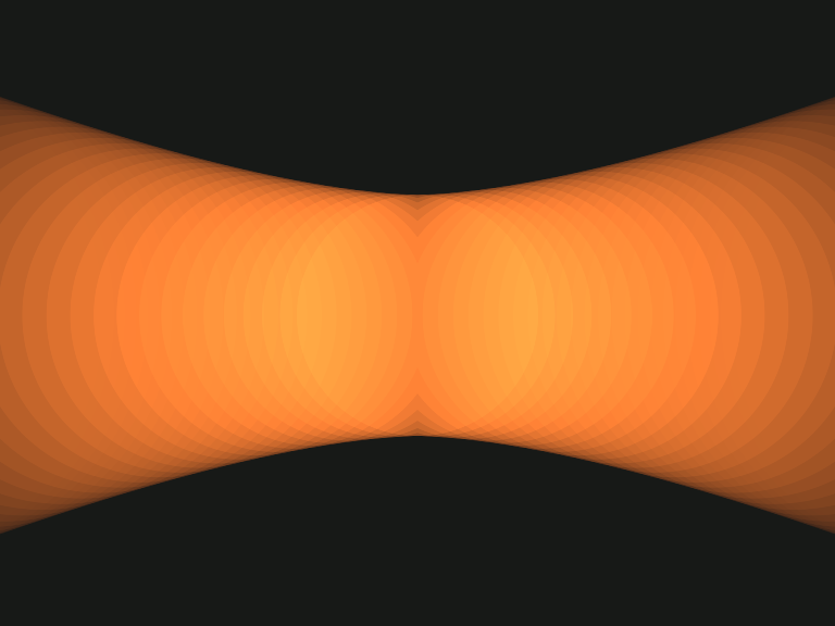
I learned Flash 2 back in 1998 by trying to create the ATV Colour Zoom ident as I thought it would be quite a good challenge and force me to look into the tool properly. For the same reason I dusted off one of the more challenging animations in my “TODO” list to learn Synfig – the BBC South West Spotlight dots titles.
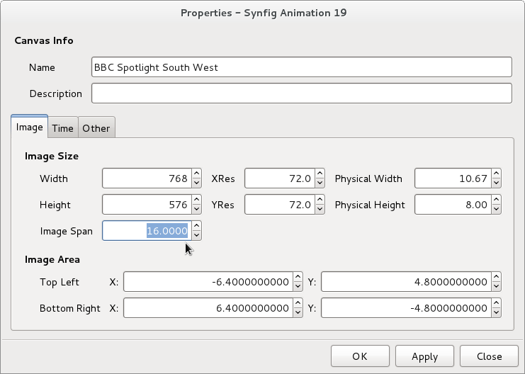
My plan was to draw the Spotlight logo in Inkscape, import that into Synfig Studio and then animate it. The first thing I did was set up my canvas. Changing the units to pixels is very important – Synfig Studio uses points by default which seems a strange choice for a tool not centred on printed work.
When I tried importing my artwork from Inkscape it came in at the wrong size:
Imported SVG from Inkscape
The reason was obscure and not what I had been expecting. I had assumed it was the old Inkscape dpi (dots per inch) problem, but it was to do with something called Image Span which is related to the aspect ratio of the end animation. After reacquainting myself with Pythagorean theorem I worked out I needed to set the Image Span to 16 for 768 by 576 pixel artwork from Inkscape.
Setting Image Span in Synfig Studio
Then artwork comes in correctly from Inkscape. However, now I could see some problems with imported SVG:
Problems with Imported Inkscape SVG
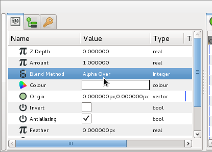
There were two problems – the holes had disappeared in the “P” and “O” and there was a segment missing from the circle of the letter “O”.
Paths with holes are imported into Synfig Studio as two objects or “layers” (everything in Synfig Studio is a layer) – the letter and its hole. To make a letter with a hole in it you need to place the hole layer above the letter layer, and then give the hole a layer an “alpha over” blend method. As you can see, the logic behind the program is very different to Flash!
Using Alpha Over in Synfig
The nick out of the letter “O” was Inkscape’s fault. When you convert text to paths in Inkscape you often get double nodes (nodes stacked on top of each other). Double nodes also cause problems in Inkscape itself so it’s always a good idea to merge these nodes in Inkscape.
The join nodes button in Inkscape
Inkscape ellipses don’t import as Synfig Studio circles (they come in as something called Blines instead), so I redrew the dots in the Spotlight logo as Synfig Studio circles to make animation easier later. In fact to get an ellipse in Synfig Studio you draw a circle and then apply a transformation layer to it – again, a bit strange for a beginner! So, now I had the artwork imported:
Inkscape SVG imported perfectly
I discovered I didn’t actually need the background rectangle I’d drawn in Inkscape in Synfig Studio, there’s a special type of layer for solid backgrounds called “Solid Colour” that always fills the background however large your animation is. This is analogous to “Background Colour” in Flash, only in Synfig Studio you could use a “Gradient” instead.
Now I needed to colour my artwork. I found a small bug in Synfig Studio which means that you cannot use the HTML-style RGB value (a six digit hexadecimal number) to enter colours. My background colour in hexadecimal was #171a17. When I entered this into Synfig Studio I got a mid grey, instead of the charcoal colour I was expecting.
A Lighter Shade of Dark
I went into the GIMP and discovered that #171a17 is equivalent to the the RGB percentages 9% 10% 9%.
The GIMP Colour Picker information dialog
I entered the values 9%, 10%, 9% into the Red, Green and Blue spinboxes on the Synfig Colours dialog box, and I got the colour I expected. However, I also found that the HTML code displayed on the Colours dialog became 010101 – not what I expected!
In Synfig Studio, the HTML code is wrong
The ever-helpful Genete on the Synfig Studio Forums suggested that I might have a non-linear palette selected for my file, but this turned out not to be the case. So the moral of the story is, sadly, only enter colour values as RGB percentages.
Speaking of colours, it would be great if Synfig Studio could load GIMP palettes, or create a palette from the currently imported layers.
I then set about animating. This is quite different to Macromedia Flash as in addition to “keyframes” you also have the concept of “waypoints”. A “keyframe” stores every setting of every “layer” item on the current canvas at a particular point, whereas a “waypoint” just stores one setting. You also have to forget about the concept of “frames” that was so key to Macromedia Flash. Synfig Studio, in common with Swift 3D, uses the concept of time instead. As far as the time-line was concerned I am very glad that I had done some work in Swift 3D before approaching Synfig Studio.
Keyframe labels appear on the canvas too
One thing I did like is the fact you could label not only your layers but your keyframes – that saved me an awful lot of scribbling! Once you have your keyframes set up Synfig Studio really excels. There are numerous different ways of defining how the animation gets from one keyframe to another. The default was TCB which gives beautiful naturalistic movement, but for Spotlight it would cause arcing like this:
Arc caused by TCB Interpolation
When I really wanted linear tweening to give me straight edges like this:
Corrected by Linear Interpolation
Another little gotcha I found whilst animating was that the time-lines starts at “0f”, not “Frame 1” as in Flash. This caught me out when I was putting the animation together as I was getting odd blank frames!
Whilst animating I came across a niggle caused by my operating System. In GNU/Linux Alt and left-click is used to move windows around. However, in Synfig Studio Alt and left-click is used to transform (i.e. scale) objects. Fedora 15’s deskptop GNOME 3 compounds this problem by removing the “Windows Movement Key” setting that you could adjust in Gnome 2 to change this behaviour. Fortunately the wonderful Synfig Studio forum came to the rescue as “nikolardo” had a cunning work-around:
“Another workaround for the Alt issue presents itself when you realize it only happens when you Alt-click. Pressing Alt and then clicking gets picked up by the WM (openbox, in my case), but clicking on a vertex and then holding the Alt key produces the scaling behavior intended. So, next time you Alt-click and the window moves, let go, and then click-Alt.”
Whilst working I found that “Groups” were not what I expected at all. The purpose of Groups in Synfig Studio is to collect disparate items around your animation so they can be selected together. In fact, when creating the animation I never used any groups at all, although I can see how they would be useful on other animations.
I loved the fact I could enter a frame number e.g. 454 to move somewhere on the time-line and it got converted into seconds and frames. I tend to think in frame numbers and it’s great I don’t have to keep dividing by 25 and working out the remainder. This was a huge help when setting up keyframes.
Useful for creating guides at 0x and 0y
Another thing I found was I could use the Canvas Metadata window, which at first seemed useless, to adjust the guides. It would be even better if you could use pixels instead of internal units to adjust the guide positions in this window.
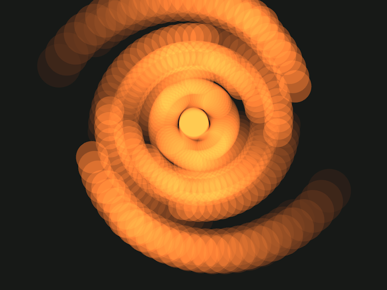
One thing I soon learned as I worked was that Synfig Studio’s canvas window is not always WYSIWYG, and the Preview Window isn’t always an accurate reflection of the end result either (but this is being rewritten for the next release) – you have to do a render in order to see how your final result is coming along. This is particularly true if you are using effects like Motion Blur. For instance, when the Spotlight S is rotating, this is what I get to see on the stage:
What you see in Synfig Studio…
Whereas this is what the end result looks like:
…is much more impressive when rendered!
Correction from Genete:
“That’s because your display quality settings were not set to high quality. There is a spin button on the top of the canvas that allows you to set the quality to 1 (better), instead of use 8 (worse) the default value. WYSIWYG is fully done always in Synfig Studio. The problem is that it takes some time to render complex effects like motion blur, duplicate layer, etc.”
For my renders I used a PNG sequence, and only rendered the frames I’d just worked on. One thing I noted when rendering is that the render progress bar and cancel button on the canvas window don’t work. In the future I would love it if a WebM render option was added to Synfig Studio, particularly given the popularity of YouTube.
Notice that zooms, blurs and colour corrections are layers.
As I’ve said before, in Synfig Studio everything is a layer. Not just every single shape but a whole host of other things such as colour changes, blur effects, tranforms. So, obviously the number of layers you get soon gets large and unwieldy. However you can “encapsulate” layers together into what are called “Paste Layers” and then deal with these encapsulated layers as one object.
The capsules show encapsulated layers
You may be thinking this sounds a bit like the Flash concept of having symbols, but it isn’t – yet. The encapsulated layers are still on the main canvas and therefore use the main canvas’s time-line. In order to use encapsulated symbols in a way analogous to Flash library symbols you need to “Export” the Paste Layer as a separate Canvas. It will then appear in the Canvas Browser.
The Canvas Browser
Now your capsule of layers is a canvas in its own right, with its own independent time-line and you can use it in a way akin to library symbols in Flash. As you work, you’ll find that the main canvas’s time-line gets cluttered with keyframes and waypoints, so it’s worth exporting encapsulated layers to simplify your work.
The only real downside of the Synfig Studio time-line design is shared by Swift 3D. It’s that you can’t add and remove things from your animation easily. If you want to “hide” something you have to set its amount to 0 and then you have to fiddle about with waypoints with constant interpolation in order to show it again. It seems too much work when you simply want to put things on and take things off of your canvas.
Exporting a Paste Layer after you have already done work on an animation needs some care. Key frames are not brought across to the new canvas, and the exported animation duration defaults to 5s (five seconds) which means you have to increase it to the right length manually. So, before you start work on an animation it’s better to decide upon its structure first. But that was always the case anyway!
One minor thing – I found that I could only remove things out of encapsulated layers by dragging and dropping which was not discoverable for me – I expected to find another way of doing it via a button of some kind too.
Put a space in an Exported Canvas name and…
Entering a canvas name with a space in gives a message telling you about the C++ standard type library throwing an exception – not something most cartoonists would find particularly helpful!
When adding an exported canvas from the canvas browser on your main canvas you can offset its start-point by any number of frames. However, the offset needs to be a negative number of frames to make it appear a positive number of frames later and a positive number to make it start earlier which foxed me for a bit too!
Anyway, enough moaning – these are only very minor points! What you should take away from all this is that with exported canvases I found I could work exactly the same way as I was used to in Flash.
This does the hard work in the Spotlight animation.
Meanwhile, back to my animation. I wanted to emulate some optical film effects in my animation. The first one, motion trails, was easy to do with the Synfig Studio Motion Blur layer. This gives you a huge amount of control over the appearance of your finished trail.
Software doesn’t get any more magical.
I also needed some “optical glow”. I achieved this very easily by using the Colour Correct layer. This actually had a setting for Over Exposure – the exact effect I wanted to emulate – built into it! I was absolutely amazed! And not only that, I could animate the Over Exposure setting too. Incredible.
A bit of Blur (of which there are a dazzling array) helped to sell the glow even more.
The range of effects you can add to your animations in Synfig Studio is truly overwhelming. I think I’ll be blogging for months about the huge range of things you can do in Synfig Studio. It is an enormous amount of fun.
Zoom layers are a very clever idea.
To zoom in and out I used, naturally enough, the Zoom layer. Having a zoom on a separate layer is incredibly sensible when you actually start using it, but seemed very odd at first appearance.
And, it goes without saying, moving the dots around the canvas in Synfig Studio was simplicity itself.
So, here’s the finished result:
Did I mention Craig Rich knew my Granny…
Synfig files are very small and compact. The final file size was tiny – 11.9KB. I found that utterly incredible and it compares very favourably to Flash.
I could have completed these titles in about two hours in Macromedia Flash 8, in Synfig it took me two days to learn the tool and complete the animation which I was quite pleased with.
Synfig is an excellent tool that is staying firmly installed on my computer! I really love using it and I am excited about what I can achieve using it in the future and the vast range possibilities it opens up. It is powerful, flexible, stable and rewards the effort you put into learning it a thousand times over. It also has a friendly and helpful community. Recommended.
One of my favourite websites is Mikey Bennett’s Vintage Technology page. I love looking at all the vintage television sets Mikey has lovingly restored back to full working order. If your old Bush has lost its colour or your horizontal hold is ruining your enjoyment of your Rank then Mikey’s your man.
Mikey on an experimental 1969 3-D television
A few years back Rory Clark created a very entertaining DVD to demonstrate all the sets in the South West England Vintage Television Museum collection that Mikey curates. The DVD featured a range of test cards and tuning signals from the very old up to the present day accompanied by a selection of tones and music. Although it has given sterling service since then, Rory wanted to create an updated and expanded DVD for Mikey.
One of the cards Rory wanted to include this time was a prototype Test Card F featuring a rather different picture in place of Carol Hersee. Here’s the original:
String vests have never photographed better
Unfortunately the surviving scan of the card wouldn’t really show off Mikey’s television sets to best effect as it has faded quite considerably – the grey linearity squares had a distinctly reddish cast and the green castellations in the reference generator area had almost gone black. Therefore Rory asked me if I could recreate the card.
To do this, I used Inkscape as I only draw items in Flash now if it’s completely unavoidable. This is what I came up with in Inkscape:
She’s gone. Was it something I said?
The hardest job when recreating the card was doing the hand lettering on the caption. I did experiment to see if I could get away with using Benguiat Condensed, but it simply didn’t look close enough. In the end, the lettering took as long as the whole of the rest of the card.
It’s interesting to see the differences between this card and Test Card F. A good place to go to find out what’s missing is Alan Pemberton’s Pembers’ Ponderings website. He has two clickable Test Card Fs which will tell you exactly what each part of the card does.
I can’t wait to see how Rory “distresses” the my Inkscape drawing to make it look like a real transparency on the finished DVD.
I’ve kerned A–Z, a–z and 0–9 of the Washington typeface so that it’s useful for most English language applications. Version 2 of the typeface is available to download here. The version 2 package includes the FontForge source file, along with a PDF showing the available glyphs. Windows users will probably need to download the 7-zip utility in order to decompress the archive file.
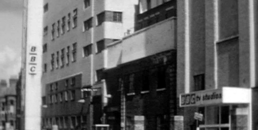
For a child born in 1971 and growing up in 70s Britain, probably the most magical place in Britain would have been BBC Television Centre. And, thanks to Blue Peter, it was a building that I was pretty familiar with. After all, Peter Purves had shown me countless times that the building was ‘like a huge doughnut, with studios around the outside, offices inside the centre ring and a fountain in the middle’.
BBC Television Centre, front gate
One of the most distinctive features of the building was its signage. The same typeface was used on everything from cameras to warning lights to the front gate.
EMI 2001 with Raymond Baxter
The typeface employed was a very common sight when I was five years old. It was used all over Chard Post Office, on signs made by SWEB (the South Western Electricity Board), and even for signs on the changing room doors at Maiden Beech School in Crewkerne. But, as I grew up, this signage was slowly replaced by signs using more modern faces. By the early 80s BBC Television Centre was just about the only place where it could be seen.
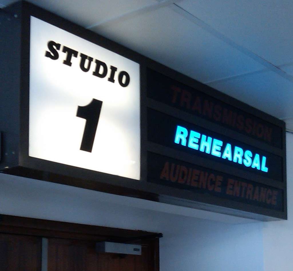
BBC Television Centre Studio One
I’d always wondered what the typeface was. The first clue was when I bought the book Encyclopedia of Typefaces by W.P. Jaspert et. al. The book contained a small scan of the face labelled as ‘Doric Italic’. This led me to search on font websites under the ‘Ds’ until I found a typeface that was called ‘AT Derek Italic’. This was close. In fact, it was very close. But it wasn’t right.
AT Derek Italic
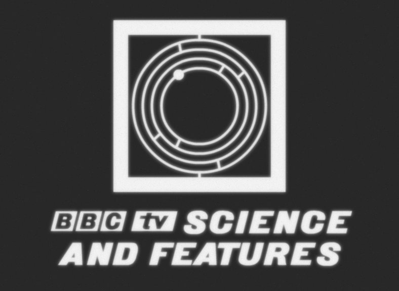
For instance, in order to recreate the 1960s caption below, I had to alter the AT Derek lettering extensively:
BBCtv Science and Features recreated
The face used came up in conversation at The Mausoleum Club. The Mausoleum Club is a web forum for people who want to talk about proper television rather than other the kind that we get these days.
By a stroke of good fortune, BBC Graphic Designer Bob Richardson was present and he told me for the first time definitively the name of the font. It was called Washington. I then spent a couple of days plucking up courage to ask Bob if he would be kind enough to send me a scan of the font so that I could recreate a digital version.
Bob was very, very kind and also keen to see a version of the font in truetype form – I received a scan of Washington the next day. The scan he sent was taken from his copy of the BBC Graphic Design Print Room specimen sheets. The book contains all of the metal typefaces that were available to graphic designers (or ‘commercial artists’ as they were initially known) from the early 1950s until circa 1980.
Washington recreated by the BBC for a capgen
Bob told me that the BBC had actually recreated Washington in a format suitable for a caption generator for ‘The Lime Grove Story’ (a 1991 documentary to commemorate the closing of the BBC’s Lime Grove studios) but the BBC didn’t have a version of the font in truetype form.
So, now I had a scan I needed to recreate the font. The plan was, as usual, to trace each character or ‘glyph’ in Inkscape…
Tracing in Inkscape
…then import the glyphs I had traced into FontForge…
Glyph imported into FontForge
…and use FontForge to generate the final typeface.
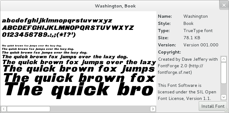
The finished typeface
This is exactly the same way as I had recreated the Central Television corporate font, Anchor and Oxford. Only this time I had the best source material possible.
As I’ve talked about recreating fonts extensively in the past I’ll just talk about a couple of things that were either new or different in this case.
P and R superimposed
The first thing of interest was that the font was a real, live metal type and it wasn’t as ‘regular’ as I had come to expect from digital faces. The width of the vertical stroke in the ‘P’ would be quite different in width to the vertical stroke in the ‘R’ which would both differ in width of the vertical stroke in the ‘D’.
It was this kind of irregularity that really gave the font its charm and sold it as an old metal typeface. Therefore I was determined to keep that as much as possible and not to try and make the font too regular and clinical by ‘fixing’ all these quirks.
R coming to the point
The second thing I needed to know was when to ignore curves. Letters such as the capital R would have curves at the corners where you would expect them to come to a point. I did toy with the idea of leaving these curves in place but that looked dreadful at large sizes so that was one thing I did end up ‘fixing’.
There were a number of glyphs I had to create myself, as they didn’t exist when Washington was created or were not a part of the original face. For instance the Greek letter mu is a combination of the letters p, q and u:
P, Q, U make a MU, Cuthbert dribbled and guffed
I also added things like Euro and Rupee currency symbols, copyright and trademark symbols and so on.
One thing I did this time, which I should have done before, was get FontForge to create all the accented glyphs for me. In other words, instead of creating separate Inkscape files for each accented character and importing them into FontForge, I simply created each accent as a glyph and got FontForge to automatically create all the accented characters for me. This saved me a huge amount of time.
Once you’ve created these few characters…
It’s important for me to have a decent coverage of the Latin alphabet as I know first hand how frustrating Hungarians find it to have to use a tilde or diaeresis instead of their double acute. I also like to make sure that the Welsh language can be used with any typeface I create.
…you get all these free!
FontForge created the accented glyphs almost perfectly and out of a few hundred glyphs I only needed to adjust half a dozen by hand. I found this pretty amazing.
Buoyed with my success at automatic accented glyph creation I thought I’d try some automatic kerning. Kerning is the adjustment of the spaces between letters. For instance the distance between the letters ‘T’ and ‘o’ in ‘To’ is quite different to the distance between the letters ‘T’ and ‘h’ in ‘The’.
Good kerning makes all the difference to the appearance of a typeface. Here’s the word ‘colour’ unkerned…
Colour with no kerning
…and here it is kerned.
Colour kerned
For all my other fonts I had sat down and kerned every possible letter combination by hand. The results are excellent but it also involves a large amount of wasted effort. The reason is that many letters (e.g. c, o and e) kern exactly the same as each other. FontForge not only allows you to put these letters into ‘classes’ to kern as a group, but it will also detect these ‘classes’ for you and attempt to kern them all into the bargain.
Kerning by classes – click to enlarge
I tried using this feature for the first time with Washington, and it worked pretty well for most letter combinations. However I do need to tweak this kerning by hand to ensure that all possible combinations of letters look good. Until this is done the font is only really useful for desktop publishing or vector art where you can alter the kerning of each letter combination by hand.
This task will take two or three days to do and it’s not something I want to do now, as it is really a job you need to come to fresh. So in about a month or so I’ll kern the font and release version 1.1 – I’ll post here when the hand kerned version is available.
So when the font is exported, how does it fair? Well, here’s an example I put together which compares Washington to AT Derek:
A comparison – click to enlarge
As you can see, AT Derek may be more elegant but Washington is definitely more ‘BBC’!
All the software I used to create the typeface was free software, including the operating system – Fedora.
You can download the latest version of the Washington font from here. Windows owners will need 7-zip to uncompress the archive. The font is free – the only thing I ask is that if you find it useful please drop me a line or add a comment below as I’d love to hear from you.
I’ve finally worked out I can put YouTube videos in my blog that can be viewed without having the Flash plug-in installed. Which is handy for me, as I don’t have the Flash plug-in installed. And presumably it’s also a boon for anyone using one of those ingenious new Apple etch-a-sketch things.
So, now I can watch stupid rubbish without using my daughters’ computer, here’s some that I (and Rory) made earlier…
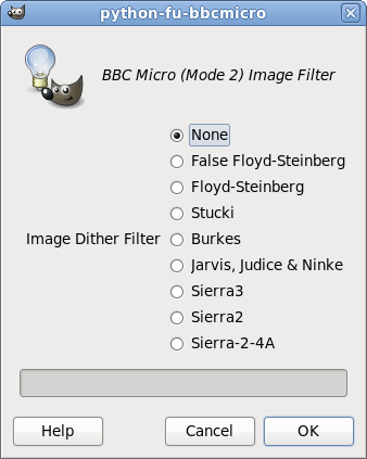
Over the past few days I’ve been converting nitrofurano‘s image filters from stand-alone sdlBasic programs to Python-Fu image filters for The GIMP. But, so far, there has been a particularly noticeable absence – the BBC Micro.
Partly that was because the BBC Micro world has already been utterly spoilt in the image conversion department by Francis G. Loch‘s incredible BBC Micro Image Converter. It’s a highly professional piece of software and does it all. I’ve posted about it many times here and the work I’ve done for Retro Software would have been utterly impossible without it.
BBC Micro Image Converter by Francis G. Loch
But partly it was because Francis’ program had inspired me to try and find out more about the mind-boggling array of dither options he had included in his program. It boasted a host of exotic sounding names like “Floyd-Steinberg”, “Sierra”, “Jarvis, Judice and Ninke” and “Stucki”.
Paulo had used a technique called Bayer ordered dither in his filters, which is similar to the traditional half-toning used in print. It’s very powerful, very fast and gives you a lovely regular patterned effect on the images, which is sometimes just what you’re after.
Naturally, Francis’ BBC Micro Image Converter does this as well. But these exotic sounding names were the inventors of various flavours of another technique: error diffusion.
Error diffusion works by trying to compensate for the colour information lost by turning a pixel into a value from a restricted palette by sharing it out amongst the surrounding pixels.
After looking at the Wikipedia entry for Floyd-Steinberg, it looked like even I could understand how to program it and then after finding an excellent article here I realised that all the other filters did exactly the same thing. They just shared out the lost information (or quantisation error) to different pixels in different proportions.
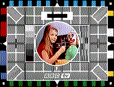
And, after a couple of hours messing about in Python, I managed to get out a servicable MODE 2 image (click on the images to enlarge):
Floyd-Steinberg error diffusion, 100% strength
You can see just how effective error diffusion is when you compare the results to the same image processed with no error diffusion:
The same image with no error diffusion
Here’s the original image for comparison:
I’m the one on the right
I excitedly added a range of different filters into my BBC Micro image filter:
Take your pick!
There was a problem though. Sierra3 was taking well over 70 seconds. This sluggishness was caused by the inefficient way in which I was checking that a pixel was within a certain range in Python.
Sierra3, 100% Strength – and very slow!
An error message I had been getting during development rather ironically proved to be the key to solving the speed problem. Instead of using time consuming range() functions to see if pixels were inside a particular range, I could use exception handling and check for an IndexError instead. This was very fast – it sped the filter up by a factor of at least four. Mind you, it still crawls along compared to Francis’ version!
The next thing I needed to add to the filter was something called “Serpentine parsing“. This means that instead of processing the image from left to right as it moves down, the computer processes the image backwards and forwards. This helps to stop all the error diffusion going in just one direction – smearing all the errors to the right.
Finally, pinching another one of Francis’ excellent ideas, I added a strength control to the filter to allow you to control how strongly the error diffusion works.
Finished interface
Here is Test Card F with 50% Floyd-Steinberg error diffusion strength:
Floyd-Steinberg error diffusion, 50% strength
And here it is with 25% Floyd-Steinberg error diffusion strength:
Floyd-Steinberg error diffusion, 25% strength
So, a BBC Micro Mode 2 image filter for The GIMP, that can be downloaded from here. However there are numerous refinements that need to be added to it. But they will have to wait for another day.
A little while ago Gareth Randall dropped me a line to let me know he was going to use my Anchor typeface for one of his projects.
Gareth is an award winning promo maker, who I first got to know when was making trails and promotions for ITV. He was one of the masterminds behind the final London Weekend Television start-up routine.
I was delighted to discover that the project Gareth had in mind was a promotion for the Doctor Who Revisitation Box set. Being a bit of a fan of Terrance Dicks and Robert Holmes this was a huge honour. So, here is Sharaz Jek trying to get Peri to suck his finger. I like to think it was my rather foxy typeface that got him in the mood…
Recently I’ve been playing about recreating various SMPTE and custom made film leaders in Flash 8 and Inkscape. One of the most interesting for me, and one that reminds me of Blue Peter for some reason, is the BBC’s own film leader. Here it is:
While working on film leaders, I’ve settled upon a hybrid Flash/Inkscape workflow in which I create the individual frames in Inkscape as Inkscape SVG files.
SMPTE Society Leader frames created as SVG files
I then export them all as EPS (Encapsulated PostScript) files so they can be imported into Macromedia Flash 8. You could export all the files from Inkscape by hand, but to save time I use a little Bash shell script instead:
#!/bin/bash
#
# Export all SVG files in a directory as EPS files

for i in *.svg; do
    inkscape $i --export-eps `basename $i .svg`".eps"

done
Then I import the EPS files into Flash and I’m ready to start putting the animation together.


