Making Music using Rosegarden on Fedora 17

I’ve always loved music – as do both of my parents. They have excellent, but divergent tastes in music. With my Mum I share a love of Sandy Denny, Jeff Lynne and George Harrison, with my father there was a shared affection for Eric Coates, Henry Hall and G. F. Handel. And when you mix the two together you get my love of Maestoso, Mike Oldfield, Kevin Ayers and Barclay James Harvest.

As well as listening to music, I also enjoy making it. But I always thought making a music on a computer seemed so difficult to do I never bothered really trying.

However, recently I got a bit of inspiration from my friend TA Walker (Tim). Earlier this year Tim signed up for something called the 5090 Challenge – writing 50 songs in 90 days. Given Tim has a full-time job, a wife and a young daughter that was insanely ambitious but astoundingly he managed 36 excellent songs which I have been known to raid for my YouTube videos. In order to reach his goal Tim was making music anywhere using anything – he was even overdubbing vocals and recording guitalele in his car during his lunch-breaks using an iPod Touch. Here is Tim playing one of his 5090 songs:

So, if Tim could make music in a car (or on a very nice looking white leather sofa) I had no excuse sitting in front of a computer that had access to a repository of free software for making noises.

I’m using Fedora 17 and I wanted to try and record music entirely using free software. This is because a) I’m on a budget of £0 and b) I think it’s the right thing to do.

Rosegarden running on Fedora 17

The first program I tried to install was something called Rosegarden. It seemed a pretty welcoming program for beginners as music programs go and therefore a good place to start. It used staves and notes – things that a dinosaur like me can (almost!) understand. However before I could get Rosegarden to make any noise I needed a synthesiser. I don’t have a real synthesiser, so instead I needed a soft synthesiser – a program that runs on the computer and pretends it’s a real synthesiser sitting on your table.

The synthesiser that everyone seemed to recommend was something called FluidSynth, so I thought I’d install that. FluidSynth is a free software synthesiser that can take MIDI data from a program like Rosegarden and turn it into audio.

It normally comes with a “SoundFont” bank containing a nice range of sounds for a beginner, so it seemed a good start. However to use FluidSynth it’s best to have a nice graphical interface so you can fiddle with it using knobs and buttons on your desktop. The most common one is called QSynth. It looks very impressive!

A very impressive addition to any desktop!

Only, before I could use the virtual synthesiser I needed something to plug it into the computer’s sound hardware. In other words, FluidSynth needs somewhere to send all this audio it’s creating. That somewhere is a piece of software called the JACK Audio Connection Kit (JACK). But before I could use JACK I thought I’d find it easier if I something graphical to could control JACK with. So I needed something called QJackCtl – a graphical JACK Control panel.

QJackCtl with JACK not started

So I downloaded all the bits I needed. I had Rosegarden (a music studio), Fluid Synth (a synthesiser), JACK (a sound server), QJackCtl (a graphical interface for JACK) and QSynth (a graphical interface for FluidSynth). It was, literally, like a house that JACK built.

Now I tried to make a noise. I worked out after a couple of minutes that it’s not enough to simply load QJackCtl – JACK has to be started and stopped by pressing the Start and Stop buttons. So I tried to start JACK and it did nothing but spit error messages at me and I certainly couldn’t get anything to make any sound.

Now, this is where the cutting-edgeness of Fedora had just bitten me on the bum. Normally you should be able to start JACK and it will work without error. And indeed, since this morning’s software repository updates that’s exactly what it does do. However at that time there was a permissions problem within Fedora so I needed to type:

su -c "modprobe snd-seq-midi"

It took me an hour or so to find that out, and before I did so I couldn’t start JACK or make any noise at all. Normally I would have given up long before this point, but with M4 and Mr Cable The Sysadmin ringing in my ears I was determined and pressed on.

There were a couple of other things I had to do in JACK to get it to work. After pressing the Setup… button I had to uncheck Realtime, check Force 16bit and change the interface to hw:0.

QJackCtl with JACK started

With JACK running happily, I started QSynth to get FluidSynth running. Everything seemed OK, so the next step was to run Rosegarden. No problems. I opened one of the examples in the examples folder, pressed the play button and success! Music!

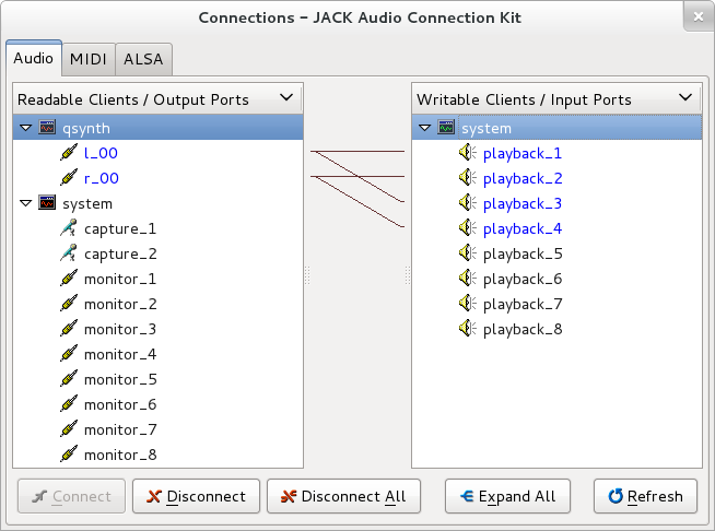
However, music on my headphones only – there was nothing coming out of my speakers. I went to QJackCtl and pressed the Connect button to see what was going on.

QSynth in headphone-only mode

As you can see, the left output of QSynth (l_00) was going to my system’s playback_1 and the right output of QSynth (r_00) was going to my system’s playback_2. This was giving me music in my headphones. However, what were the other playbacks?

QSynth will now use my speakers too

I tried to connect the left output of QSynth (l_00) to playback_3 and the right ouput (r_00) to playback_4, and it worked. Music through my speakers!

So every time I want to make music I…

  1. load QJackCtl, 
  2. start JACK by pressing the Start button, 
  3. load QSynth 
  4. then load Rosegarden

…always in that order.

Provided I just wanted to enter musical notation into Rosegarden I was now fine, but that’s not much fun. The frustrated Woolly Wolstenholme in me wanted to have a keyboard to play!

The trouble was as well as not having a synthesiser, I don’t have a keyboard either. Fortunately there are “virtual keyboards” available that allow you to play music using your computer’s keyboard. The one I chose out of a field of three was called Virtual MIDI Piano Keyboard (VMPK). I chose this one because it was the only one that seemed able to play nicely with the Hungarian keyboard on my computer.

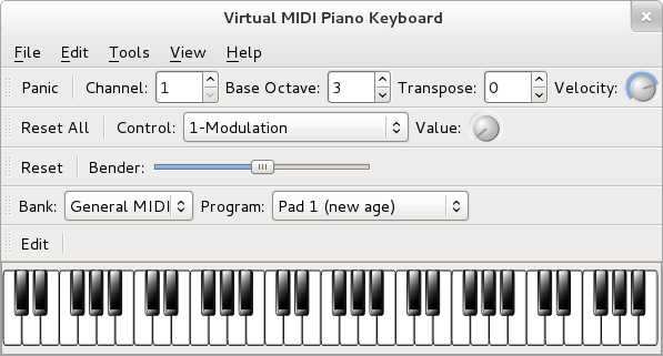
Be Woolly in the comfort of your own home…

However, in order to record MIDI data created with a virtual keyboard meant I had to plug it into something that records MIDI data – Rosegarden. It was back to the QJackCtl Connect dialog:

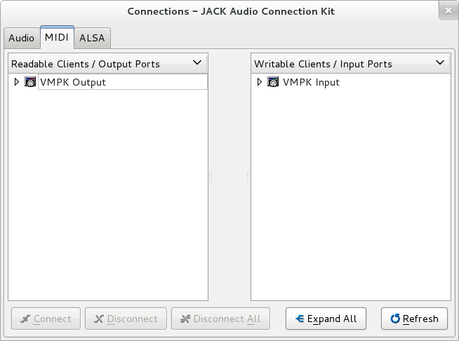
VMPK running, but QJackCtl shows nothing to plug it into

VMPK had appeared in the MIDI tab of the QJackCtl Connect dialog. The trouble was, nothing else did – the only thing I could plug my virtual keyboard into was itself.

This proved to be a very tricky problem to sort out. It took me a long time to find an answer but the answer was a program called a2jmidid. Apparently there are two kinds of MIDI on a GNU/Linux machine – ALSA MIDI and JACK MIDI. They can’t talk to each other without a “bridge” program. The bridge is called a2jmidid and it’s available in the Fedora repository. To use it I had to start a terminal window and type:

a2jmidid

Then, provided I kept the terminal window open, when I go back to my QJackCtl Connect dialog I get some extra things in the MIDI tab:

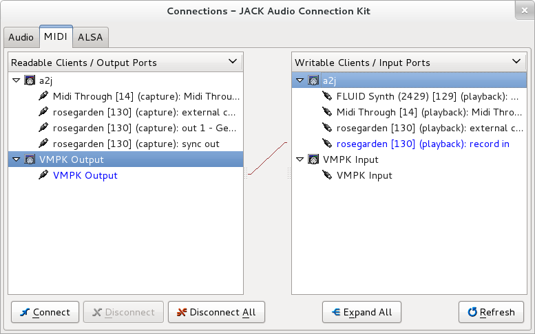
VMPK connected to Rosegarden in QJackCtl

As you can see, I can now connect the VMPK Output to the Rosegarden record in and, hey bingo, I’ve got a MIDI keyboard connected to Rosegarden.

VMPK configured for a Magyar keyboard

The only thing left to do with VMPK is create a Hungarian key mapping – this was very easy to do using a dialog provided by the program.

The first thing I wanted to try and record was a tune I remembered from my childhood. It was an early music or baroque piece for recorder and a small ensemble used by the Open University before their morning broadcasts. I have never heard since early mornings in the 1980s when I used to get up early to watch a maths foundation course on calculus or the foundation course on modern art.

A lost childhood memory

I did a rather twee arrangement using a harpsichord, viola, cello and a recorder. I think the real thing was less Bach and more Henry VIII.

However when I came to play it the recorder just didn’t sound right. It sounded very good, but it didn’t sound like the recorder I had in my head. So I looked on-line to see if there were any other SoundFont banks I could use with QSynth.

I was in luck because the pianist and composer S. Christian Collins has put together an excellent SoundFont for bank for QSynth and put it on his website here. It’s called the GeneralUser GS Soundfont bank.

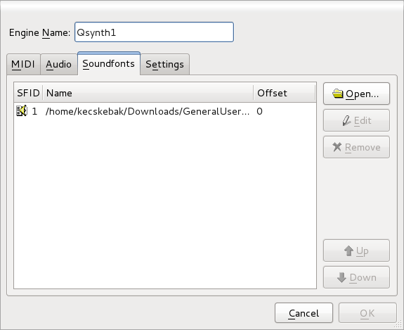
GeneralUser GS Soundfont bank loaded into QSynth

To load it I had to get QSynth running and press Setup…. Next, I had to go to the Soundfonts tab and replace the default soundfont bank (an sf2 file) with the GeneralUser GS SoundFont bank I had downloaded.

To my delight the recorder sounded much more how I wanted it to sound.

So now I  had finished and was happy with my sounds I realised I needed some way of recording what I’d just done as an audio file instead of a Rosegarden file.

When I ran QJackCtl with nothing else running the Connect dialog looked like this:

By default I can only get sound from the microphone

If you look at the Readable Clients box on the left you’ll see the only place I could get any audio is from  capture_1 and capture_2. They represent the microphone socket on my computer. capture_1 is the left channel and capture_2 is the right channel of the stereo microphone input.

If I ran Rosegarden I found they were connected automatically to Rosegarden’s record in 1 L and record in 1 R Input Ports:

Rosegarden connects to the microphone automatically

I looked in the QJackCtl Setup dialog and saw a Monitor check box which was unchecked. It sounded like what I needed so I checked it.

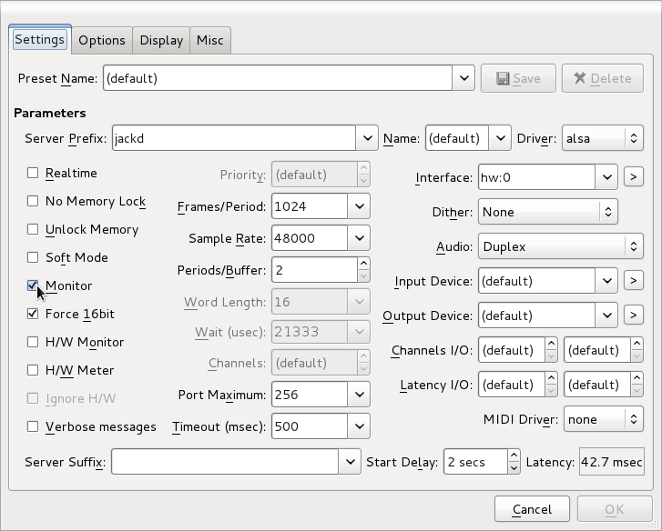
However you can enable monitoring

When I restarted JACK I saw this:

And route the monitor output where you want it

So now I have monitor output in addition to microphone input as a potential source of audio. What monitor output means is that I can record whatever I can hear through the speakers. This is just what I needed.

Such as here, where the monitor output is routed to Rosegarden

I started Rosegarden up again and connected up monitor_1 and monitor_2 to record_in_2 L and record_in_2_R.

This meant that now Rosegarden had the system’s sound output available as a source of audio. Now I could use Rosegarden to record whatever Rosegarden was playing as an audio file!

You can easily turn the metronome off in Rosegarden

Setting this up in Rosegarden is quite easy and pretty logical once you work it out (which took me a long time!). The first thing you need to do is go to Studio-> Manage Metronome to turn off the click track. You usually don’t want that on your master recordings!

The next thing you need is an audio track that can accept the monitor output as its audio input:

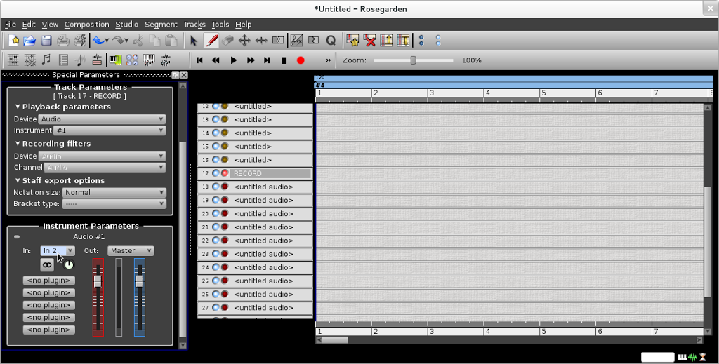
Rosegarden all set up to record Rosegarden

You can see in the picture above I’ve set track 17 as my current track. It’s an audio track and I’ve called it RECORD.

On the left hand side you’ll notice that I’ve set the In: to In2. This is very important – In2 is the Rosegarden input we connected up to the monitor output in QJackCtl earlier. Never use In1 – it’s quiet and full of  interference noise!

Finally you’ll notice I’ve armed track 17 to record – shown by the red light to the left of the track name. Now when I press the record button the my Rosegarden file will play and be recorded as an audio file on track 17 at the same time.

My recorded Rosegarden output in Rosegarden

When the track has finished you will see the waveform displayed in your recording track as it is above.

Double-clicking on an audio track segment in Rosegarden opens Audacity

Now you can double click on the recorded segment and it will open in Audacity. Don’t forget to set Audacity to JACK Audio Output as I have in the picture above, or it will freeze and not play.  From Audacity you can edit or export the audio in the usual way.

For OGG Vorbis files or MP3 files I normalize to -2.0dB

I always save a lossless FLAC file from Audacity first. If I want to save to a lossy format such as OGG Vorbis or MP3 I always Normalize to -2.0 dB first before I export.

Being able to set Audacity to use JACK audio output is very handy – particularly if you find you want to listen to audio files while you are working.

So now I had a FLAC file, an Ogg Vorbis file and an mp3 file. The FLAC file was fine, but what I really wanted to do was get a picture in my mp3 and ogg files so they would be just like the ones I downloaded from TA Walker’s Bandcamp page.

To do this I found an excellent program called EasyTAG which does exactly what it’s name suggests. This program allows you to add a picture to your audio files and is very easy to use. Although I tend to use Ex Falso for most of my tagging (it’s better for classical music) I’ll use EasyTAG for tagging my own files in future.

The next thing I decided to do was re-record the OU Tune in Mike Oldfield style. When I was a child I remember watching Simon Groom visit Mike Oldfield to see him re-record the Blue Peter signature tune. That video had a enormous effect on me as a child and recording something like that was something I always wanted to try.

I had a lot of fun in Rosegarden pretending to be Mike – particularly tapping away on my computer’s keyboard pretending to play the bodhrán.

When I finished Tim very kindly recorded a real electric guitar solo for me to add to my track. He supplied it to me as a FLAC file, but the funny thing was I could not find any way of importing a FLAC file into Rosegarden – only .WAV files.

TA Walker’s solo shown on the red track

However, by accident, I discovered you could import FLAC files directly into Rosegarden if you dragged and dropped them onto the time track.

I’d enjoyed myself so much with the Open Universtiy tune I decided to record another tune Mike Oldfield-stylee, so I dusted off my recording of Border Television’s Keltic Prelude March by L. E. DeFrancesco and did that as well!

The reason I did the Keltic Prelude March was so that I could upload my video of a Border Television start-up that I had pulled down earlier this year. The reason I had pulled it down was because of a copyright claim over the track Holiday People by James Clarke that I had used over the menu rundown. Therefore I decided I would also create a pastiche of Holiday People to use in my Border start-up. I came up with a tune I called Lionel’s Talking!

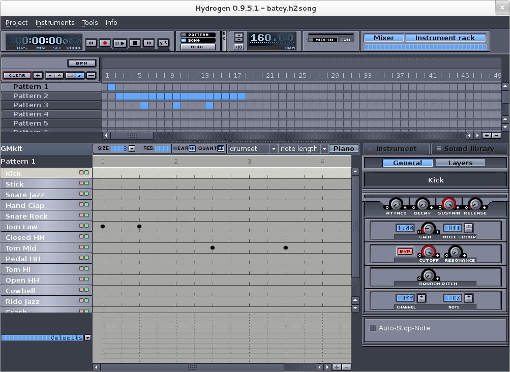
Lionel’s Talking in Hydrogen

I needed a “real” drum kit for Lionel’s Talking so I decided to use a special drum synthesiser called Hydrogen which does the job flawlessly. Hydrogen also works beautifully in tandem with Rosegarden. The Rosegarden website has a wonderful tutorial to explain how to do this here.

So put it all together and what do you have? Well something like this…

Producing music on GNU/Linux can be a bewildering and frustrating experience at first. There are so many things you need – each one has to be set up correctly in order to work properly. There is a huge amount to learn and sometimes you feel the easiest thing is to just give up. I spent a lot of time trying, and failing, to do things which I thought should have been easy.

In addition, differences in hardware mean what you have to do get everything working is slightly different for everyone.

But with a little perseverance you find that things rapidly begin to make sense, there is a common logic that underlies all the things you have to do and you begin working out answers to your problems yourself.

I hope you try making some music too.

Cheap Dirty Film

Three years ago I talked about the programs I used to simulate old 16mm film. Back in 2008 I was using Windows XP, Adobe Premiere Elements 4.0 and a VirtualDub filter called MSU Old Cinema. I found I could use them to create some half-decent 16mm film:

These days I’m using Fedora 15 as my operating system and Kdenlive as my off-line video editor. That meant I’ve had to change the way I simulate old film quite a bit. I have been continuing to use VirtualDub and the MSU Old Cinema plug-in via WINE. Although VirtualDub is free software, the MSU Old Cinema plug-in is not, and this bothered me. I wondered what I could achieve in Kdenlive alone and I started experimenting.

In the course of this blog post I’m going to use the same image – an ITV Schools light-spots caption from the 70s that I recreated in Inkscape. Here’s the original image exported directly from Inkscape as PNG:

Created in Inkscape

The most obvious sign that you are watching something on a bit of old film are the little flecks of dirt that momentarily appear. If the dirt is on the film itself it will appear black. If it was on the negative when the film is printed it will appear white.

Kdenlive comes with a Dust filter that tries to simulate this effect. However, it has a very small database of relatively large pieces of dirt. In total there were just six pieces of dirt, drawn as SVG files, and that limited number led to an unconvincing effect. If I used the filter on a long piece of video I found I began to recognise each piece! There were also no small bits of dirt.

I drew 44 extra pieces of dirt in Inkscape and added them to the Dust filter. I also redrew dust2.svg from the default set. I call this particular piece of dirt “the space invader” as I found it was too large and too distracting!

The video below compares the Dust filter (with identical settings) before and after I added my extra files:

You may find you prefer the Kdenlive dust filter with just the default six SVG files. However, if you prefer what I have done you can download my extra SVG files from here.

With the modifications I’ve made, I actually prefer the dirt created by the Dust filter in Kdenlive to the dirt you get in the MSU Old Cinema plug in. The dirt from Kdenlive’s filter is less regular in shape and simply by changing the SVG files in the /usr/share/mlt/oldfilm folder I can tailor the dust to any specific application I have in mind.

After flecks of dirt, the second most obvious effect that you are watching old film is a non-uniform shutter causing the picture to appear to flicker very slightly. The MSU Old Cinema plug-in can simulate this effect, but wildly over does it. It is not suitable for anything other than simulating silent movies, so I never used it.

Luckily the Kdenlive Old Film plug-in does a much more convincing job. The settings that I found worked for me are shown below:

KdenLive Old Film settings for uneven shutter

And they create the results shown below:

It looks a bit odd on it’s own, but when added to all the other effects I’m describing here it will look fine.

I’ve noticed that when I am creating these effects it’s best if I move away from the monitor to a normal TV viewing distance to see how they look – otherwise I tend to make the effects too subtle to be noticed when I come to watch the results on my television!

The next thing that will help to sell the output as film is having some film grain. Film grain is irregular in shape and coloured. In fact, I used the Colour Spots setting of the MSU Noise filter to create film grain in VirtualDub.

Kdenlive has a Grain filter, which simply creates random noise of 1 pixel by 1 pixel in size. Although technically this is not at all accurate, it can look pretty good if you are careful.  The settings for film grain will vary from job to job, so some trial and error is involved.

As a starting point, these settings are good:

Kdenlive Grain settings

And will look like this:

Again, it looks odd by itself (and you can’t really see it at all on lossy YouTube videos!) but it will look fine when added to the other effects. You’ll start to notice the rendering begin to slow down a bit when you have added Grain! Incidentally, Grain is still worth adding even if YouTube is your target medium because it helps break up any vignette effect you add later.

The next thing you need to do is to add some blur – edges on 16mm film in particular tend to be quite soft. Kdenlive has a Box Blur filter which works just fine for blurring. How much blur you add depends on your source material, but a 1 pixel blur is fine as a starting point.

Colour film is printed with coloured dyes, so it has a different colour gamut to the RGB images you create with The GIMP, Inkscape or a digital video camera. In addition, it also fades over time. Therefore to make computer-originated images look like film-originated images some colour adjustment is normally required.

Luckily, Kdenlive has a Technicolor filter that allows you to adjust the colours to better resemble film.

Kdenlive Technicolor settings

The way colour film fades depends on whether it has been kept in a dark or light place. If I’m recreating a colour 16mm film that has been stored safely in a dark tin for many years, I make it look yellowish. If I’m recreating a colour 16mm film that’s been left out in the light a bit too much I make it look blueish. Both these looks rely adjusting the Red/Green axis slider – not the Blue/Yellow axis slider as you might think!

Source image faded with Technicolor

You soon begin to notice that the telecine machines used by broadcasters could adjust the colours they output to make colours that were impossible to resolve from the film. For instance, some of the blue backgrounds on ATV colour zooms were too rich to have been achieved without some help from the settings on the telecine machine. So the precise colour effect you want to achieve varies from project to project, and sometimes you will be actually increasing colour saturation rather than decreasing.

The Technicolor filter is, ironically, the filter you use to make colour source material monochrome too!

The biggest problem when trying to recreate old film is recreating gate weave – that strangely pleasing effect whereby picture moves almost imperceptibly around the screen as you watch.

MSU Old Cinema created an accurate but very strong gate weave which was too severe for recreating 16mm film. The Kdenlive Old Film filter has what it calls a Y-Delta setting, that makes the picture jump up and down by a set number of pixels on a set number of frames. It’s easy and quick (a Y-Delta of 1 pixel on 40% of frames is good) but introduces black lines at the top of the frame and is so obviously fake it won’t really fool anyone!

So there is, sadly, no quick way to create gate weave in Kdenlive. However, the good news is there is a way, provided you’re prepared to do a bit of work. You need to use the Pan and Zoom filter. The Pan and Zoom filter is intended to do Ken Morse rostrum camera type effects – it’s particularly good if you have a large image and want to create a video to pan around it.

However, what we can do is use the Pan and Zoom filter to move the frame around once per second. Firstly you zoom the image in by 108%. This means you won’t see any black areas around the edge of the frame as the picture moves around.

First of all, zoom the image very slightly

Next, you create key frames on each second:

Then add one key frame per second

Then you move the image around slightly on each keyframe – plus or minus two or three pixels from the starting position is often plenty.

Obviously, for a 30 second caption that’s 30 keyframes and 30 movements – a lot of work if done “by hand”. However it won’t go to waste, as you can save your Pan and Zoom settings as a Custom effect and resuse it again and again on different clips.

And, luckily, doing all this by hand isn’t even necessary. Custom effects are stored as simple XML files in the /kde/shared apps/kdenlive effects folder so it is possible to write a small Python script to automatically create as much gate weave as you want – something I’ll come back to.

As well as gate weave, you can also use the Pan and Zoom filter to stretch the frame, which is perfect for simulating stretched film. Again, that’s hopefully something I’ll return to another time.

Here’s an example of video moving with the Pan and Zoom filter:

The Pan and Zoom filter also adds hugely to your rendering time, so it’s best to switch it off until you do your final render.

Glow is a very important effect to add when simulating film, particularly monochrome film. Kdenlive does not have a glow filter, so if I need to add glow to a video file I have to improvise. I export the video as a PNG sequence, add glow to the PNG files using a GIMP batch script (written in Scheme), and then reimport the video file. It’s worth the effort, as it’s amazing how much glow helps to sell something as being originated on film.

Glow added using The GIMP

The GIMP glow filter tends to be rather harsh, and tends to wash out images if you use too much glow. Therefore you have to experiment a lot.

Finally, there is often uneven brightness or contrast visible across a film frame. In VirtualDub I used a filter called the Hotspot filter. The hotspot filter is actually designed to remove this effect from old film, but turned out to be just as good at putting the effect in!

However, with Kdenlive, this effect is best achieved in the GIMP when required as Kdenlive’s Vignette effect is too unsubtle to be of any real use.

So, put it all together, and you get something like this:

All in all, Kdenlive does a pretty good job of making digitally originated images look like 16mm film but although there is room for improvement. The film scratches filter needs work, there is no glow and the film grain is really just noise rather than grain. However you can still get some excellent results and I’m really pleased with it.

Spotlight on Synfig

The only thing I haven’t been able to do using free software since moving to GNU/Linux in 2008 is animate. And it bugged me. Everything else – raster graphics, vector graphics, offline video editing, audio editing, font design, desktop publishing – I could achieve, but animation was the reason I’ve had WINE and Macromedia Flash 8 installed on my machine for the past three years.

When I first started playing with GNU/Linux I came across a program called Synfig Studio which could do animation, but at that time it needed to be compiled from source code. It seemed a bit too much like brain surgery for a GNU/Linux beginner! However, the other day I was banging my head trying to do some animation in Flash. I decided to Google for any free software tools that might be able to help and I was reminded of Synfig Studio once again.

Blue hair? Why, it’s Mrs. Slocombe!

I went to the Synfig Studio website and the first thing I noticed was that a brand new shiny version of Synfig Studio was available as an RPM for Fedora. In other words, all I had to do was download, double click and go. Everything worked perfectly. I found the Synfig Studio website was excellent, there were a large number of tutorials and an extensive manual and so I set about reading.

Animation programs are always off-putting to beginners due to their complexity, and Synfig Studio was no exception – partly because it began life as an in-house tool in a professional animation company and that really shows in the power and complexity of what it offers.

I learned Flash 2 back in 1998 by trying to create the ATV Colour Zoom ident as I thought it would be quite a good challenge and force me to look into the tool properly. For the same reason I dusted off one of the more challenging animations in my “TODO” list to learn Synfig – the BBC South West Spotlight dots titles.

My plan was to draw the Spotlight logo in Inkscape, import that into Synfig Studio and then animate it. The first thing I did was set up my canvas. Changing the units to pixels is very important – Synfig Studio uses points by default which seems a strange choice for a tool not centred on printed work.

When I tried importing my artwork from Inkscape it came in at the wrong size:

Imported SVG from Inkscape

The reason was obscure and not what I had been expecting. I had assumed it was the old Inkscape dpi (dots per inch) problem, but it was to do with something called Image Span which is related to the aspect ratio of the end animation. After reacquainting myself with Pythagorean theorem I worked out I needed to set the Image Span to 16 for 768 by 576 pixel artwork from Inkscape.

Setting Image Span in Synfig Studio

Then artwork comes in correctly from Inkscape. However, now I could see some problems with imported SVG:

Problems with Imported Inkscape SVG

There were two problems – the holes had disappeared in the “P” and “O” and there was a segment missing from the circle of the letter “O”.

Paths with holes are imported into Synfig Studio as two objects or “layers” (everything in Synfig Studio is a layer) – the letter and its hole. To make a letter with a hole in it you need to place the hole layer above the letter layer, and then give the hole a layer an “alpha over” blend method. As you can see, the logic behind the program is very different to Flash!

Using Alpha Over in Synfig

The nick out of the letter “O” was Inkscape’s fault. When you convert text to paths in Inkscape you often get double nodes (nodes stacked on top of each other). Double nodes also cause problems in Inkscape itself so it’s always a good idea to merge these nodes in Inkscape.

The join nodes button in Inkscape

Inkscape ellipses don’t import as Synfig Studio circles (they come in as something called Blines instead), so I redrew the dots in the Spotlight logo as Synfig Studio circles to make animation easier later. In fact to get an ellipse in Synfig Studio you draw a circle and then apply a transformation layer to it – again, a bit strange for a beginner! So, now I had the artwork imported:

Inkscape SVG imported perfectly

I discovered I didn’t actually need the background rectangle I’d drawn in Inkscape in Synfig Studio, there’s a special type of layer for solid backgrounds called “Solid Colour” that always fills the background however large your animation is. This is analogous to “Background Colour” in Flash, only in Synfig Studio you could use a “Gradient” instead.

Now I needed to colour my artwork. I found a small bug in Synfig Studio which means that you cannot use the HTML-style RGB value (a six digit hexadecimal number) to enter colours. My background colour in hexadecimal was #171a17. When I entered this into Synfig Studio I got a mid grey, instead of the charcoal colour I was expecting.

A Lighter Shade of Dark

I went into the GIMP and discovered that #171a17 is equivalent to the the RGB percentages 9% 10% 9%.

The GIMP Colour Picker information dialog

I entered the values 9%, 10%, 9% into the Red, Green and Blue spinboxes on the Synfig Colours dialog box, and I got the colour I expected. However, I also found that the HTML code displayed on the Colours dialog became 010101 – not what I expected!

In Synfig Studio, the HTML code is wrong

The ever-helpful Genete on the Synfig Studio Forums suggested that I might have a non-linear palette selected for my file, but this turned out not to be the case. So the moral of the story is, sadly, only enter colour values as RGB percentages.

Speaking of colours, it would be great if Synfig Studio could load GIMP palettes, or create a palette from the currently imported layers.

I then set about animating. This is quite different to Macromedia Flash as in addition to “keyframes” you also have the concept of “waypoints”. A “keyframe” stores every setting of every “layer” item on the current canvas at a particular point, whereas a “waypoint” just stores one setting. You also have to forget about the concept of “frames” that was so key to Macromedia Flash. Synfig Studio, in common with Swift 3D, uses the concept of time instead. As far as the time-line was concerned I am very glad that I had done some work in Swift 3D before approaching Synfig Studio.

Keyframe labels appear on the canvas too

One thing I did like is the fact you could label not only your layers but your keyframes – that saved me an awful lot of scribbling! Once you have your keyframes set up Synfig Studio really excels. There are numerous different ways of defining how the animation gets from one keyframe to another. The default was TCB which gives beautiful naturalistic movement, but for Spotlight it would cause arcing like this:

Arc caused by TCB Interpolation

When I really wanted linear tweening to give me straight edges like this:

Corrected by Linear Interpolation

Another little gotcha I found whilst animating was that the time-lines starts at “0f”, not “Frame 1” as in Flash. This caught me out when I was putting the animation together as I was getting odd blank frames!

Whilst animating I came across a niggle caused by my operating System. In GNU/Linux Alt and left-click is used to move windows around. However, in Synfig Studio Alt and left-click is used to transform (i.e. scale) objects. Fedora 15’s deskptop GNOME 3 compounds this problem by removing the “Windows Movement Key” setting that you could adjust in Gnome 2 to change this behaviour. Fortunately the wonderful Synfig Studio forum came to the rescue as “nikolardo” had a cunning work-around:

“Another workaround for the Alt issue presents itself when you realize it only happens when you Alt-click. Pressing Alt and then clicking gets picked up by the WM (openbox, in my case), but clicking on a vertex and then holding the Alt key produces the scaling behavior intended. So, next time you Alt-click and the window moves, let go, and then click-Alt.”

Whilst working I found that “Groups” were not what I expected at all. The purpose of Groups in Synfig Studio is to collect disparate items around your animation so they can be selected together. In fact, when creating the animation I never used any groups at all, although I can see how they would be useful on other animations.

I loved the fact I could enter a frame number e.g. 454 to move somewhere on the time-line and it got converted into seconds and frames. I tend to think in frame numbers and it’s great I don’t have to keep dividing by 25 and working out the remainder. This was a huge help when setting up keyframes.

Useful for creating guides at 0x and 0y

Another thing I found was I could use the Canvas Metadata window, which at first seemed useless, to adjust the guides. It would be even better if you could use pixels instead of internal units to adjust the guide positions in this window.

One thing I soon learned as I worked was that Synfig Studio’s canvas window is not always WYSIWYG, and the Preview Window isn’t always an accurate reflection of the end result either (but this is being rewritten for the next release) – you have to do a render in order to see how your final result is coming along. This is particularly true if you are using effects like Motion Blur. For instance, when the Spotlight S is rotating, this is what I get to see on the stage:

What you see in Synfig Studio…

Whereas this is what the end result looks like:

…is much more impressive when rendered!

Correction from Genete:

“That’s because your display quality settings were not set to high quality. There is a spin button on the top of the canvas that allows you to set the quality to 1 (better), instead of use 8 (worse) the default value. WYSIWYG is fully done always in Synfig Studio. The problem is that it takes some time to render complex effects like motion blur, duplicate layer, etc.”

For my renders I used a PNG sequence, and only rendered the frames I’d just worked on. One thing I noted when rendering is that the render progress bar and cancel button on the canvas window don’t work. In the future I would love it if a WebM render option was added to Synfig Studio, particularly given the popularity of YouTube.

Notice that zooms, blurs and colour corrections are layers.

As I’ve said before, in Synfig Studio everything is a layer. Not just every single shape but a whole host of other things such as colour changes, blur effects, tranforms. So, obviously the number of layers you get soon gets large and unwieldy. However you can “encapsulate” layers together into what are called “Paste Layers” and then deal with these encapsulated layers as one object.

The capsules show encapsulated layers

You may be thinking this sounds a bit like the Flash concept of having symbols, but it isn’t – yet. The encapsulated layers are still on the main canvas and therefore use the main canvas’s time-line. In order to use encapsulated symbols in a way analogous to Flash library symbols you need to “Export” the Paste Layer as a separate Canvas. It will then appear in the Canvas Browser.

The Canvas Browser

Now your capsule of layers is a canvas in its own right, with its own independent time-line and you can use it in a way akin to library symbols in Flash. As you work, you’ll find that the main canvas’s time-line gets cluttered with keyframes and waypoints, so it’s worth exporting encapsulated layers to simplify your work.

The only real downside of the Synfig Studio time-line design is shared by Swift 3D. It’s that you can’t add and remove things from your animation easily. If you want to “hide” something you have to set its amount to 0 and then you have to fiddle about with waypoints with constant interpolation in order to show it again. It seems too much work when you simply want to put things on and take things off of your canvas.

Exporting a Paste Layer after you have already done work on an animation needs some care. Key frames are not brought across to the new canvas, and the exported animation duration defaults to 5s (five seconds) which means you have to increase it to the right length manually. So, before you start work on an animation it’s better to decide upon its structure first. But that was always the case anyway!

One minor thing – I found that I could only remove things out of encapsulated layers by dragging and dropping which was not discoverable for me – I expected to find another way of doing it via a button of some kind too.

Put a space in an Exported Canvas name and…

Entering a canvas name with a space in gives a message telling you about the C++ standard type library throwing an exception – not something most cartoonists would find particularly helpful!

When adding an exported canvas from the canvas browser on your main canvas you can offset its start-point by any number of frames. However, the offset needs to be a negative number of frames to make it appear a positive number of frames later and a positive number to make it start earlier which foxed me for a bit too!

Anyway, enough moaning – these are only very minor points! What you should take away from all this is that with exported canvases I found I could work exactly the same way as I was used to in Flash.

This does the hard work in the Spotlight animation.

Meanwhile, back to my animation. I wanted to emulate some optical film effects in my animation. The first one, motion trails, was easy to do with the Synfig Studio Motion Blur layer. This gives you a huge amount of control over the appearance of your finished trail.

Software doesn’t get any more magical.

I also needed some “optical glow”. I achieved this very easily by using the Colour Correct layer. This actually had a setting for Over Exposure – the exact effect I wanted to emulate – built into it! I was absolutely amazed! And not only that, I could animate the Over Exposure setting too. Incredible.

A bit of Blur (of which there are a dazzling array) helped to sell the glow even more.

The range of effects you can add to your animations in Synfig Studio is truly overwhelming. I think I’ll be blogging for months about the huge range of things you can do in Synfig Studio. It is an enormous amount of fun.

Zoom layers are a very clever idea.

To zoom in and out I used, naturally enough, the Zoom layer. Having a zoom on a separate layer is incredibly sensible when you actually start using it, but seemed very odd at first appearance.

And, it goes without saying, moving the dots around the canvas in Synfig Studio was simplicity itself.

So, here’s the finished result:

Did I mention Craig Rich knew my Granny…

Synfig files are very small and compact. The final file size was tiny – 11.9KB. I found that utterly incredible and it compares very favourably to Flash.

I could have completed these titles in about two hours in Macromedia Flash 8, in Synfig it took me two days to learn the tool and complete the animation which I was quite pleased with.

Synfig is an excellent tool that is staying firmly installed on my computer! I really love using it and I am excited about what I can achieve using it in the future and the vast range possibilities it opens up. It is powerful, flexible, stable and rewards the effort you put into learning it a thousand times over. It also has a friendly and helpful community. Recommended.

Numlock Edge

If you are considering installing the Fedora GNOME 3 Beta and want to try and use it for anything vaguely useful, I’d strongly advise installing numlockx along with it. This ensures your Num Lock key is enabled by default, thus preventing you from inadvertently teaching your neighbours some new English vocabulary.

Washington Post

For a child born in 1971 and growing up in 70s Britain, probably the most magical place in Britain would have been BBC Television Centre. And, thanks to Blue Peter, it was a building that I was pretty familiar with. After all, Peter Purves had shown me countless times that the building was ‘like a huge doughnut, with studios around the outside, offices inside the centre ring and a fountain in the middle’.

BBC Television Centre, front gate

One of the most distinctive features of the building was its signage. The same typeface was used on everything from cameras to warning lights to the front gate.

EMI 2001 with Raymond Baxter

The typeface employed was a very common sight when I was five years old. It was used all over Chard Post Office, on signs made by SWEB (the South Western Electricity Board), and even for signs on the changing room doors at Maiden Beech School in Crewkerne. But, as I grew up, this signage was slowly replaced by signs using more modern faces. By the early 80s BBC Television Centre was just about the only place where it could be seen.

BBC Television Centre Studio One

I’d always wondered what the typeface was. The first clue was when I bought the book Encyclopedia of Typefaces by W.P. Jaspert et. al. The book contained a small scan of the face labelled as ‘Doric Italic’. This led me to search on font websites under the ‘Ds’ until I found a typeface that was called ‘AT Derek Italic’. This was close. In fact, it was very close. But it wasn’t right.

AT Derek Italic

For instance, in order to recreate the 1960s caption below, I had to alter the AT Derek lettering extensively:

BBCtv Science and Features recreated

The face used came up in conversation at The Mausoleum Club. The Mausoleum Club is a web forum for people who want to talk about proper television rather than other the kind that we get these days.

By a stroke of good fortune, BBC Graphic Designer Bob Richardson was present and he told me for the first time definitively the name of the font. It was called Washington. I then spent a couple of days plucking up courage to ask Bob if he would be kind enough to send me a scan of the font so that I could recreate a digital version.

Bob was very, very kind and also keen to see a version of the font in truetype form – I received a scan of Washington the next day. The scan he sent was taken from his copy of the BBC Graphic Design Print Room specimen sheets. The book contains all of the metal typefaces that were available to graphic designers (or ‘commercial artists’ as they were initially known) from the early 1950s until circa 1980.

Washington recreated by the BBC for a capgen

Bob told me that the BBC had actually recreated Washington in a format suitable for a caption generator for ‘The Lime Grove Story’ (a 1991 documentary to commemorate the closing of the BBC’s Lime Grove studios) but the BBC didn’t have a version of the font in truetype form.

So, now I had a scan I needed to recreate the font. The plan was, as usual, to trace each character or ‘glyph’ in Inkscape

Tracing in Inkscape

…then import the glyphs I had traced into FontForge

Glyph imported into FontForge

…and use FontForge to generate the final typeface.

The finished typeface

This is exactly the same way as I had recreated the Central Television corporate font, Anchor and Oxford. Only this time I had the best source material possible.

As I’ve talked about recreating fonts extensively in the past I’ll just talk about a couple of things that were either new or different in this case.

P and R superimposed

The first thing of interest was that the font was a real, live metal type and it wasn’t as ‘regular’ as I had come to expect from digital faces. The width of the vertical stroke in the ‘P’ would be quite different in width to the vertical stroke in the ‘R’ which would both differ in width of the vertical stroke in the ‘D’.

It was this kind of irregularity that really gave the font its charm and sold it as an old metal typeface. Therefore I was determined to keep that as much as possible and not to try and make the font too regular and clinical by ‘fixing’ all these quirks.

R coming to the point

The second thing I needed to know was when to ignore curves. Letters such as the capital R would have curves at the corners where you would expect them to come to a point. I did toy with the idea of leaving these curves in place but that looked dreadful at large sizes so that was one thing I did end up ‘fixing’.

There were a number of glyphs I had to create myself, as they didn’t exist when Washington was created or were not a part of the original face. For instance the Greek letter mu is a combination of the letters p, q and u:

P, Q, U make a MU, Cuthbert dribbled and guffed

I also added things like Euro and Rupee currency symbols, copyright and trademark symbols and so on.

One thing I did this time, which I should have done before, was get FontForge to create all the accented glyphs for me. In other words, instead of creating separate Inkscape files for each accented character and importing them into FontForge, I simply created each accent as a glyph and got FontForge to automatically create all the accented characters for me. This saved me a huge amount of time.

Once you’ve created these few characters…

It’s important for me to have a decent coverage of the Latin alphabet as I know first hand how frustrating Hungarians find it to have to use a tilde or diaeresis instead of their double acute. I also like to make sure that the Welsh language can be used with any typeface I create.

…you get all these free!

FontForge created the accented glyphs almost perfectly and out of a few hundred glyphs I only needed to adjust half a dozen by hand. I found this pretty amazing.

Buoyed with my success at automatic accented glyph creation I thought I’d try some automatic kerning. Kerning is the adjustment of the spaces between letters. For instance the distance between the letters ‘T’ and ‘o’ in ‘To’ is quite different to the distance between the letters ‘T’ and ‘h’ in ‘The’.

Good kerning makes all the difference to the appearance of a typeface. Here’s the word ‘colour’ unkerned…

Colour with no kerning

…and here it is kerned.

Colour kerned

For all my other fonts I had sat down and kerned every possible letter combination by hand. The results are excellent but it also involves a large amount of wasted effort. The reason is that many letters (e.g. c, o and e) kern exactly the same as each other. FontForge not only allows you to put these letters into ‘classes’ to kern as a group, but it will also detect these ‘classes’ for you and attempt to kern them all into the bargain.

Kerning by classes – click to enlarge

I tried using this feature for the first time with Washington, and it worked pretty well for most letter combinations. However I do need to tweak this kerning by hand to ensure that all possible combinations of letters look good. Until this is done the font is only really useful for desktop publishing or vector art where you can alter the kerning of each letter combination by hand.

This task will take two or three days to do and it’s not something I want to do now, as it is really a job you need to come to fresh. So in about a month or so I’ll kern the font and release version 1.1 – I’ll post here when the hand kerned version is available.

So when the font is exported, how does it fair? Well, here’s an example I put together which compares Washington to AT Derek:

A comparison – click to enlarge

As you can see, AT Derek may be more elegant but Washington is definitely more ‘BBC’!

The Washington Book typeface is released under the SIL Open Font licence.

All the software I used to create the typeface was free software, including the operating system – Fedora.

You can download the latest version of the Washington font from here. Windows owners will need 7-zip to uncompress the archive. The font is free – the only thing I ask is that if you find it useful please drop me a line or add a comment below as I’d love to hear from you.

Fedora 15 Beta, GNOME 3

Recently, a rather nasty crash caused by the gftp FTP client locked me out of all my files and shut me out of my Desktop. The program is rather ropey and has done odd things to my computer before so I really shouldn’t have been using it.

Still, every cloud has a silver lining and since then I’ve moved to Filezilla as an FTP client (which is a lot better anyway) and become rather less blasé about making backups.

GNOME 3 Desktop – Click to enlarge

As I needed an OS reinstall I also decided to take the plunge and install Fedora 15 Beta. I’d been reading about GNOME 3 for years so I thought it was high time I tried it for myself.

Here are my thoughts so far:

Pros:

  • I was delighted to find my Trust 5300 graphics tablet works out of the box. No compiling and installing Wizardpen and playing around with settings. This is very important to me as I’m fond of using MyPaint to paint pictures when I’m listening to podcasts. It’s also very useful in conjuction with The GIMP.
  • I was disappointed at first to find that Colour Management was missing, but once added using Add/Remove Software it’s better than ever. Work has been done to make it easier to use and it has had some bug fixes too. Colour Management would be enough to justify my using GNOME3 on my production machine.
  • Firefox 4 is fantastic – I love being able to play HTML5 videos at long last without needing a Flash plug-in.
  • I was surprised that I couldn’t just press Delete in the Nautilus File Manager to remove files. You have to press Ctrl+Delete together. However, I like this better as it makes it much harder to delete things by accident.
  • It only took me about 30 seconds to work out how to use it.
  • It gets out the way most of the time and lets you get on with your work.

Cons:

  • The most serious problem is what happens when you switch off the computer. For some reason the Shut Down option is missing unless you hold down the Alt key. By default, you can only Suspend, rather than Shut Down your computer. This would be no problem at all if it were not for the fact that Suspend only works about one time out of four for me; Suspend is simply not stable enough to replace Shut Down.
  • You cannot alter how fonts are hinted on screen. This is very irritating as the default settings make text look, frankly, revolting.
  • The weather widget is missing – it showed the current weather, temperature and windspeed. I find that hugely irksome – I don’t mind it not being on the desktop but you should be able to see it when you click on the time at the top of the screen.
  • The title bars on the windows are too tall for no good reason. The whole of the rest of the interface seems to be about conserving vertical space, yet this throws away everything gained by losing the bottom panel.
  • Some dialog boxes are missing close buttons.

The whole system feels very stable indeed and I’m using it on my production machine quite happily even though, really, I shouldn’t be!