One of the many mysteries of having a home computer as a teenager was why the picture looked so much better on colour monitor than it did on a domestic television. And indeed, why the image on a domestic television looked sharper if you turned down the colour.
Later on, I discovered it was due the PAL system that the BBC Micro used to send pictures to the television. PAL ingeniously chucks away loads of colour information in order to keep the bandwidth of analogue colour television pictures down to a level that made broadcasting them practical.
After reading an excellent article on the subject by Alan Pemberton, I thought I’d have a go and see if I could simulate what PAL does to an image in The GIMP.
As a starting image, I used a CEEFAX page I’d made in Teditor (by Jim Notman, The Micro User, Volume 2 Issue 6) on the BBC Micro emulator BeebEm. Obviously teletext looked nothing like as good as this on a domestic television.
My starting image – click to enlarge. It never looked this good on a telly!
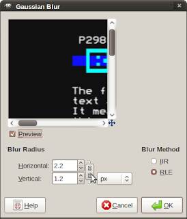
To begin with I added a Gaussian Blur to the image. I broke the link between the horizontal and vertical blur radii so that I blurred more horizonally (2.2) than vertically (1.2). It’s worth playing with this.
This button breaks the link between the radii
The next thing I needed to work out was how to split the image up into three different images – one containing red, one containing blue and one containing green. I discovered the Levels dialog box in The GIMP would do this for me.
To make the Red channel I created a duplicate of my original image with Ctrl+D. Then I brought up the Levels dialog box and then:
- selected blue channel from the Channel combo box
- dragged black pointer below the input levels graph to far right
- selected green channel from the Channel combo box
- dragged black pointer below the input levels graph to far right
The Red channel
To make the Blue channel I created a duplicate of my original image with Ctrl+D. I brought up the Levels dialog box and:
- selected red channel from the Channel combo box
- dragged black pointer below the input levels graph to far right
- selected green channel from the Channel combo box
- dragged black pointer below the input levels graph to far right
The Blue Channel. Sounds a bit rude…
Finally, I made the green channel from my original image. To do this I:
- selected green channel from the Channel combo box
- dragged black pointer below the input levels graph to far right
- selected blue channel from the Channel combo box
- dragged black pointer below the input levels graph to far right
That meant I had three images – one which was the red channel, one which was the blue channel and one which was the green channel.
The green channel was finished – I didn’t need to touch this as the PAL system relies on a high resolution green image and adds a low resolution red and blue image to this.
The finished Green channel. It will not be scaled like Red and Blue.
However, to both the red and blue channels I needed to lower the horizontal resolution quite drastically. Therefore I scaled both images to be 197 x 576. Then scaled them both back to 788 x 576 – their original size – again.
The Red channel after being scaled
Next I copied both the red and blue images into the green image as new layers. I used the Addition blend mode in the Layers, Channels, Paths dialog box to blend the images together.
Here is the low resolution red image added to the high resolution green image.
Red and Green images on separate layers blended using “Addition”
Here are the low resolution red and blue images added to the high resolution green image.
The end result – click to enlarge.
Well, it’s not perfect, but it was nearly what I was after and I was over the moon.
With a bit of playing around with the way you scale the channels it’s possible to get a fairly realistic PAL effect. The image below has various filters added to it, and I think it looks like an almost passable knock off of an off-screen photo.
Click to enlarge. Needs a bit more work, I think.
What I want to do next is to turn this into a filter in Python to automate the process and allow it to be fined tuned.


