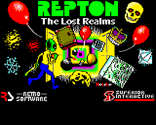
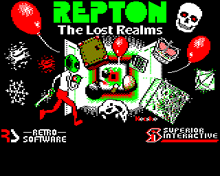
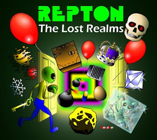
Repton: The Lost Realms loading screen

After I created the artwork for “Repton: The Lost Realms“, Dave Moore of Retro Software asked me if I would create a loading screen for the BBC Micro and Acorn Electron versions of the game. Initially the brief was quite loose – he thought we needed a Mode 5 screen for the cassette versions and a Mode 1 screen for the disc versions.

My cover artwork for Repton: The Lost Realms

On a BBC Micro or Electron, Mode 1 and Mode 5 are both four colour screen modes. The difference is that in Mode 1 the resolution is 320 x 256, whereas in Mode 5 the resolution is 160 x 256. However, both images are the same size because in Mode 5 the pixels are twice as wide as they are high. Due to its lower resolution, Mode 5 uses half the memory of Mode 1 so will load far more quickly for those using cassette recorders.

My first thought was to create the Mode 1 screen, and to use the excellent BBC Micro Image Converter software by Francis G Loch. This is an application written in PureBasic that takes image files (bmp, jpg, etc.) and downconverts them into the native screen display formats of the BBC Micro. To aid you in doing this it offers an almost bewildering array of image processing options specifically tailored for getting modern images into BBC Micro format. It can  also takes BBC Micro screen dumps and convert them to modern image formats.

BBC Micro Image Converter copes with anything

I use Ubuntu Linux, which means I have to run the Windows binary of the BBC Image Converter under WINE. I’ve found the operation of the program under WINE to be problematic if you don’t export import and output images from and to the WINE “C:Program Files” folder. It also seems happier with being fed bmp files than pngs under WINE.

Inspired by Michael “Mic” Hutchinson’s excellent loading screen for the disc version of Repton Inifinity, I decided to use the same Red, Black, White Green palette. I was very pleased by my early results – particularly the way the brown came out on the safe. However I hadn’t left any room for branding and so on.

My first try in BBC Image Converter

So I decided to create a version that had an area at the bottom that could be removed in the same way as the version on Repton Infinity disc for loading messages etc.

My rejected disc loading screen

I showed Dave this version and he had a number of reservations – the main one being that the loading screen in Mode 1 didn’t really grab him at all. He wanted something more colourful for the disc version, and he suggested trying Mode 2. Mode 2 is identical to Mode 5, apart from the fact you can use eight colours.

The first thing I did was to create a screen in Inkscape that was 320 x 256 pixels that was set out exactly as I wanted to my loading screen to look. I would use this to feed into the BBC Micro Image Converter.

The image I made to feed into the BBC Micro Image Converter

When I imported it, the results were excellent. In fact, the results were too good. Although obviously I needed to retouch here and there to tidy up the writing and the balloon strings I was overwhelmed by the feeling that really I should be producing something that was done by hand on a pixel editor – not put through some ingenious image processing we could only dream of in 1987.

All it needs now is for me to make it a bit rubbish

Therefore I fired up “The GIMP” and tried to add a sort of “hand designed” feel a pixel at a time. I was quite aware that what I was doing wasn’t as good as what the BBC Image Converter could produce, but the idea was to get a “retro” feel.

Final image after I gave it a “hand made” feel in The GIMP

I showed Dave Moore and he was happy with the Mode 2 screen, so the next job was to produce the cassette loading screen in Mode 5.

When it came to creating a Mode 5 screen, I decided to convert the eight colour Mode 2 screen to a four colour Mode 5 screen by hand, instead of running through the BBC Image Convertor again. This was because I wanted to keep the two loading screens as close as possible to each other in appearance.

I reduced the colour depth by hand in The GIMP

Dave was happy, so that was my first two loading screens for Retro Software done and dusted.

Repton: The Lost Realms is under development by Retro Software. Repton name used by permission of Superior Interactive.

The BBC Image Converter is currently released under a non-free licence but it’s free as in beer to use for commercial or non commercial uses. You can look at a number of the PureBasic routines Francis wrote for it here.

Repton Thru Time

Back in the 1980s, when I had a BBC Model B running Acorn MOS instead of a PC running Ubuntu, I used to be a very keen Repton player.

If you haven’t heard of it, Repton is an engrossing puzzle game that also contains arcade elements and it seems to appeal equally to people of all ages. My youngest daughter Mary is 6 years old and a particularly keen player.

In 1986 the third Repton game was released and it was my Christmas present from my parents that year. Although Repton 3 wasn’t my favourite Repton game (that was always Repton 2) it did allow you to design your own screens and, even better, redesign the game characters.

I soon became a keen Repton character designer, and this obsession held when I received into Repton Infinity. But I never showed my screens to anyone else at the time. I didn’t even know another BBC user with Repton!

The Repton 3 Editor

I used to particularly look forward to summer holidays and half terms when my Dad would bring home a BBC Master 128 which meant I could flip between the editor and game by pressing the break key. This small improvement speeded up designing Repton screen sets enormously.

In the middle of last year, on the Stairway To Hell forums, Acorn enthusiast Andrew Weston announced that he was putting together a website of all the non-official Repton levels that people had designed over the years. I mentioned that I had some but they were on 5.25″ floppy disc and I had no way of transferring them to a BBC Micro.

One of the forum administrators, “Samwise”, offered very kindly to transfer my discs to Emulator disc images that I could run on my PC. And, by return of post, I had my Repton 3 levels (and many other things beside) working on BeebEm on my PC.

Not all of my levels were on the discs I sent to Samwise, but the three sets with the best graphics were (some of my better level designs will have to wait for another time).

I sent the levels off to Andrew and he added them to his website and, after that, things seemed to take on a life of their own.

First came the offer from Dave Moore of Retro Software to design graphics for their forthcoming release “Repton: The Lost Realms“.

After that the person who is undoubtedly the world’s best Repton player, “Michael S. Repton”, reviewed my levels and was very kind about them indeed. Not only that, but he produced videos of him completing some of them and added them to his YouTube channel.

My aim, back in the late 80s was to design a “Round Britain Whizz” set of Repton 3 levels, with 5 sets set in different locations around the country. I designed three of the sets.

First there was a farming set based on the farm I grew up on in Somerset.

There’s the old BP oil can we had in the shed, my goat Timmy, the farmhouse, the Dutch barn, lots of barbed wire, fixing broken bails with binder twine and chasing errant cows into the right fields.

The next set was London – based on the Palace of Westminster. I always enjoyed visiting London as a child, I loved the tube and Oxford Street and the sights.

It contains lots of clichés of London – rain, American tourists, bobbies on the beat, portraits of the Queen and mugs of tea. The fungus in this set was supposed to be “the growing unemployed”.

And finally there was Rovers – based on Coronation Street.

Rovers, running in BeebEm

Again, a lot clichés in this one – whippets, terraces, dark satanic mills, Hilda Ogden, Keir Hardie’s cap and tellies tuned to Granada.

Michael also pointed out something I didn’t know – my screens had been converted to PC Repton 3 format by Richard Hanson of Superior Interactive no less! Incidentally, if you’ve never seen them, the Superior Interactive PC versions of Repton are really quite something, and are well worth anyone’s money.

The interesting thing about all this to me is that once you make your work available to others it takes on a life of its own that’s wonderful to see.

Obviously other interests and schoolwork got in the way and I never actually completed my level sets but I’m hoping that one day I’ll get the chance to go back and finish them all off. Maybe even for “Repton: The Lost Realms”.

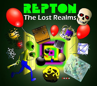
Repton: The Lost Realms artwork

Some time after the release of Repton 3, Paras Sidapara started work on “Repton 4” for the BBC Micro and Acorn Electron, a new Repton game with several novel features. When Repton Infinity came along the game was reworked as a new game, Cyroid:X, before being dropped completely.

Paras’s Repton 4 game was thought lost until a year ago when it was recovered from an old 5.25″ disc. Development on the game resumed, and Retro Software got permission from Superior Interactive to release the game for the BBC Micro and Acorn Electron. The project was retitled “Repton: The Lost Realms” in order to avoid confusion with the Repton 4 game in Repton Infinity and Superior’s Repton 4:EGO game for the Archimedes.

Dave Moore of Retro Software approached me and asked how I would feel about trying to come up with some cover art for the game.

I bit his hand off. Repton was a bit of an obsession to me when I was growing up, and no Christmas was complete without me receiving the latest Repton release. I spent hour upon hour playing, designing screens and designing graphics. The game itself looks like Boulderdash superficially but is a very different creature to play – it’s more of a logic puzzle and attracts large numbers of chess players.

The first thing I did was to doodle on the back on an envelope whilst I was on the phone:

The Scream

The Repton in the sketch owes more to Edvard Munch than Tim Tyler, but it showed roughly what I wanted to do. My idea was a bit like “The Secret Garden”, with Repton opening a door and finding fantastic “lost realms” inside. Doors are also a feature of the game itself, so it seemed the obvious thing to do.

I chose to produce the artwork in vector format. This was because as we planned to print everything from small tape inlays to A2 promotional posters from the artwork. This meant I had to export 600dpi bitmap images from my work, so vector artwork seemed the best way to go. I chose Inkscape as I’d heard it’s the best vector artwork package available, it runs perfectly on Ubuntu Linux and because it saves artwork as, svg, a completely free format.

The original Repton artwork was done by Ellis Ives Sprowell Partnership in Wakefield. They gave Repton a very strong brand image so all I had to do was follow their lead and not mess it up. The REPTON logo was traced in Inkscape from a scan of the advert for the original REPTON release to get it as accurate as possible. The subtitle was in the font Eras, just as it was in the original releases.

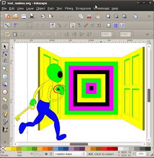
As this was my first major project in Inkscape I started simple. Just outlines and solid, non-gradient fills. I drew Repton, a couple of doors and a transporter and then sent it to Dave and Paras.

Start off simple

Paras’s wife seemed fascinated by Repton’s bum, but apart from that everyone was happy so I decided to explore flood fills and shading.

Gradient fills gave me endless trouble in Inkscape for a long time. This is because having been so used to the way Adobe Flash handled gradient fills: creating them in a dialog box. Therefore I simply assumed I was supposed to use them the same way in Inkscape and it gave me endless headaches – creating gradient fills using the dialog in Inkscape is for masochists. It wasn’t until after I created the botched artwork for “Zap!” I finally worked out the “Inkscape” way to handle flood fills – using the gradient tool and the mouse – and never had a problem with them again.

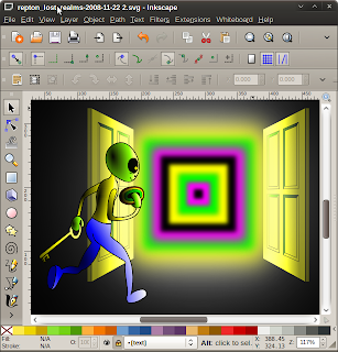
Anyway, taking about three times as long as I needed to, I finally created a shaded image. I also tried some blurring and glowing too, and was happy with the results so far. The idea is that Repton is in darkness but lit by light coming from the transporter. I had to fight a bit for this with Dave as he understandably wanted everything light and bright to make his posters and packaging eyecatching, whereas I wanted the lighting to be more moody.

I wish I had known what I was doing…

I chose cartoony black outlines for the poster, to match the original Repton artwork, and also tried hard to make my Repton character look like the Repton in the original artwork.

Next, I needed to create all the other game characters eminating from the “lost realms” doorway. Because of the need to create cover artwork of varying aspect ratios for cassette, disc, posters and in order to make life simpler I created each of the game characters in a separate Inkscape file. That meant I could put the picture together at the end. This saved me hours and hours of work in the end, as the final composition was a result of a lot of too-ing and fro-ing between Dave and myself.

The individual characters took between an hour and four hours to create, the crown taking the longest. Many of them are deliberately based on the original artwork for the Repton games – for instance the diamond, safe, boulder and cage. I did this to underline the fact that the game is part of the same family as the rest of the Repton games. I’m particularly pleased with the way the safe turned out.

Bunch of dodgy characters

The spirit gave me the most trouble as it’s a very difficult thing to portray in a “cartoon” like way. Look at the spirits in the previous Repton artwork to see how tricky they are to do justice too. In the end I based the spirit on Matthew Atkinson’s Repton 3 design. I also had trouble with the egg – my first attempt looked like “a yellow finger nail” according to Paras! Incidentally, you may notice a fly agaric – I’ve always liked toadstool fungus in Repton, but Paras and Dave vetoed the idea.

After abandoning my idea of a brick wall (like the one in my pencil sketch), I’d originally intended the artwork to be on a black background, but Dave Moore suggested a green gradient fill, which worked out very well indeed. And with that, it was finished.

The end result

The final artwork worked out very well – as a first major project in Inkscape I’m quite proud of it. It has the Repton feel that I was after and also shows off the new features of the game prominently. Dave Moore told me he asked Richard Hanson of Superior Interactive if he would have used my artwork at the time. He said “Yes”, which put me on a high for a week.

Contributing to an officially sanctioned Repton project of any kind makes you part of BBC Micro history and I’m very proud to have contributed to a real Repton game – it’s a long standing ambition fulfilled.

Repton: The Lost Realms is currently under development by Retro Software. Repton name used with permission from Superior Interactive.